


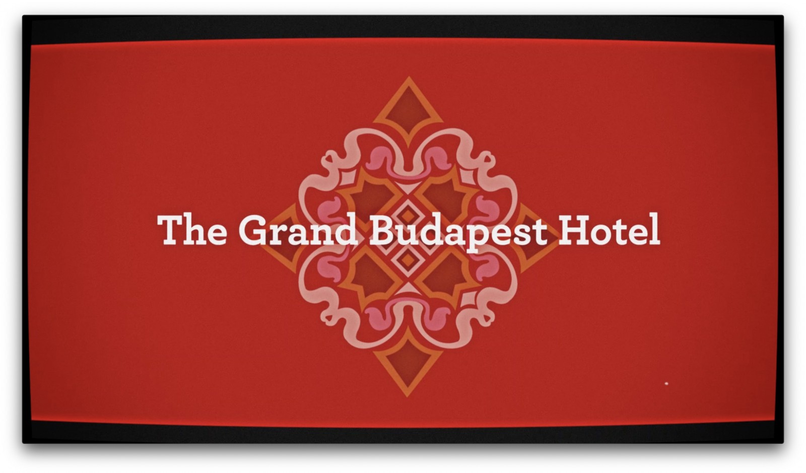
The introduction of different people or different parts of the movie are done through these very carefully framed and composed screens. They have different typographical elements to it and are also in the theme of what is to come ahead in the movie.
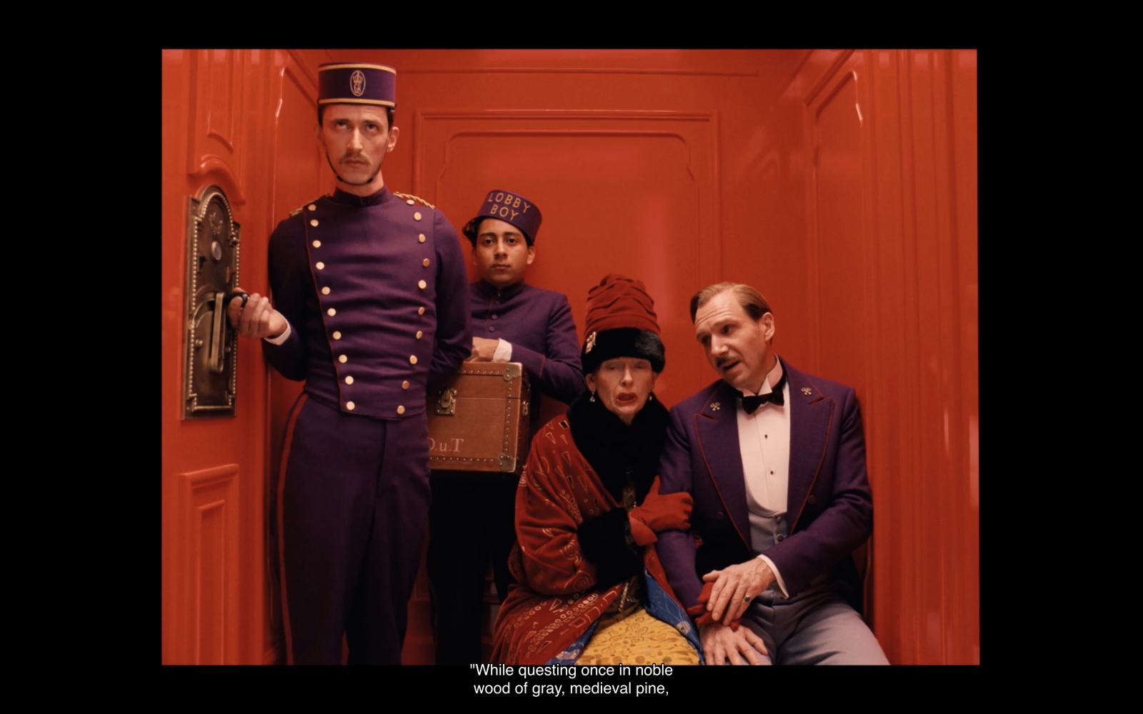
A well-composed Wes Anderson shot with symmetry and the two main characters stuck together with one another in a small space just like they would be after the event that occurs in the movie after this.

One of the staple shots in Anderson movies are what I like to call "God Eye Shots", these are shots with the camera placed directly over the object these are also called "Over-head shots"

Typography study: 1 There are a lot of typographic elements present throughout the movie and are quite beautifully composed around the time and year of the event happening in the movie.

Typographic study: 2 We see a shift from a well-composed colour palette of muted pastel colours to a brown them surrounding the prison and how everything is going dull and out of the way in the most comical sense.

Typographic study: 3 Another interesting shot which I think is quite beautiful, on how it brings your focus on the important part of the whole frame by using a magnifying glass.

The fictional brand created in the movie by designer Annie Atkins there are a lot of fictional things created for the film and all of them are beautifully curated and shown-off during the time frame of the movie.

Typographic study: 4 This frame also marks the return of the pink colour palette and is again curated with utmost attention to detail, which is quite evident due to the symmetry in this still shot.
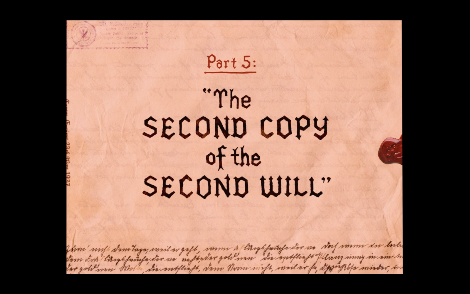
Typographic study: 5 These "part" shots have a theme in common, they act as a prologue into what the next part is going to be about like this part revolved around finding a letter. The elements in these shots act as a sneak-peak into what's about to come next.

Typographic study: 6 The script in the subtitles part is the handwriting of Annie Atkins and it goes well with the shot because the character on the right of the frame is reading a letter.

We know the names of all the different types of the hotel through these keys and the respective keychains. They were quite intuitive as every hotel had it's own key and keychain.

Another fictional brand in the movie is "Mendl's" and the intricate details on the box and the cart. The shot is again very symmetrical.

The painting around which most of the movie progresses around. It also belonged to a character who's death initiated the cat and mouse race in the movie.
The movie begins in the present day, when a young reader renders a sign of homage at a monument to the author of a book called “The Grand Budapest Hotel.”
The film is inspired by the writings of Stefan Zweig, an Austrian author who achieved considerable fame in the 1920’s and 30’s but has since faded into obscurity. On a talk show with iTunes for Apple TV Anderson said that he was particularly inspired by Zweig’s novels Beware of Pity and The Post-Office Girl, which articulate complex and layered stories against the backdrop of Europe in the early-mid 20th century.
Most notably, Anderson shot the movie using a variety of aspect ratios. Most common of which was a box, square, and almost as if the whole film was shot on an old VHS tape. The bulk of Grand Budapest is shot in the Academy ratio, which is 1.33:1, 1.37:1, or 4:3 (square, almost). All of the 1930’s scenes in the movie are shot in this ratio, which is the same as older tv’s and computer monitors.
The 1960’s scenes are shot in the panorama-like 2.35:1 ratio that Anderson has used in most of his previous films. These also include the traditional “Fish-Eye” lens or anamorphic lenses.
The scenes which begin and end Grand Budapest are shot in the more modern 1.85:1 ratio.
The particular equipment chosen for the production was an Arri 35mm camera, Kodak Vision 200T color negative filmstock, Red Epic, and a Canon 5D MarkII. As much as the movie’s location is a fictional country, the years of the action are also fictional.
The hotel is the embodiment of Gustave’s taste, and Gustave is the embodiment of its delights. It’s a state of affairs that matches Anderson’s own art: the virtual signature that’s present like a watermark throughout his work is also a part of his personal style, his dress and his manner, his very way of life. The artist isn’t just the creator of style but also its bearer, and the artist’s very presence is a work of art in person, creation on the wing by means of a turn of phrase, a gesture, a way of dressing, the aura of charismatic influence.
Gustave is also a connoisseur of people, and that’s the spark of the story: his adoption, as a sort of disciple, of the hotel’s new lobby boy, Zero Moustafa, a dark-skinned refugee from war in the Middle East. Just as Gustave’s intimate life is inseparable from his public role, so he recruits Zero for a personal adventure that reveals the fiber of Gustave’s theatrical demeanor.
Looking at this film and how the events unfold and the actor’s reactions to those event, the camera movement and even the settings, it takes me back to Charlie Chaplin, and Shawn the Sheep cartoonish like features. I can almost imagine Wes Anderson directing a Charlie Chaplin movie with an executive color theme and lavish set design. The camera movements are quite an interesting part of the movie and Wes Anderson’s films in general. The God’s Eye view, as I like to call it, the overhead shot, the seamless transition into another scene with camera rotation. The movements are quite mechanical and add to the flair of the movie.
he story, of the lost grandeur of a hotel that is restored and perpetuated by way of a book, is also the story of a tradition of personal nobility—a severe and self-imposed code of conduct that proves, in the face of historically terrifying and catastrophic trouble, to be a rock of steadfast decency. That tradition, in turn, is preserved and perpetuated in art: “The Grand Budapest Hotel” is the closest thing to a credo, a discourse of principle, that Anderson has yet offered.
5 Words:
Mechanical, Color, Stop-Motion, Funky, Off-Beat, Symmetry
Thesis Statement:
In the 1930s, the Grand Budapest Hotel is a popular European ski resort, presided over by concierge Gustave H. (Ralph Fiennes). Zero, a junior lobby boy, becomes Gustave's friend and protege. Gustave prides himself on providing first-class service to the hotel's guests, including satisfying the sexual needs of the many elderly women who stay there. When one of Gustave's lovers dies mysteriously, Gustave finds himself the recipient of a priceless painting and the chief suspect in her murder.

Retro, Symmetry, Grany, Old Film, Pastel Colors, Grandeur, Typography, and Compositional.
The colour palette of the movie and how it transitions throughout the movie. It plays an important role in the movie and is very crucial to the likes of Wes Anderson.

Checklist for all the characters to include. Basically, to note down their traits, the way they were introduced, their personal characteristics and to study their overall screentime.

Storyboard and the flow of animations throughout the title. The camera movement, animation, scene transition, audio effects, and illustrator sketches.

Other details like picking up apples, revealing the name of the actors, special traits and design decisions to be made in illustrator file and then, later on, to be displayed in the final render of the file.

More scenic options which can be explored, camera movement and the introduction of vignette for a transitional scene. Inspired by Wes Anderson's camera movements in the movie and also the revel of things in a very "comical" way.

Ending sequence with instructions for the end, as in the movie. The shift from 4:3 (square) aspect ratio to 16:9 (panoramic) view for the titles, which provides for a seamless transition into the movie. This is also how the movie ends, which in a way, comes a full circle.


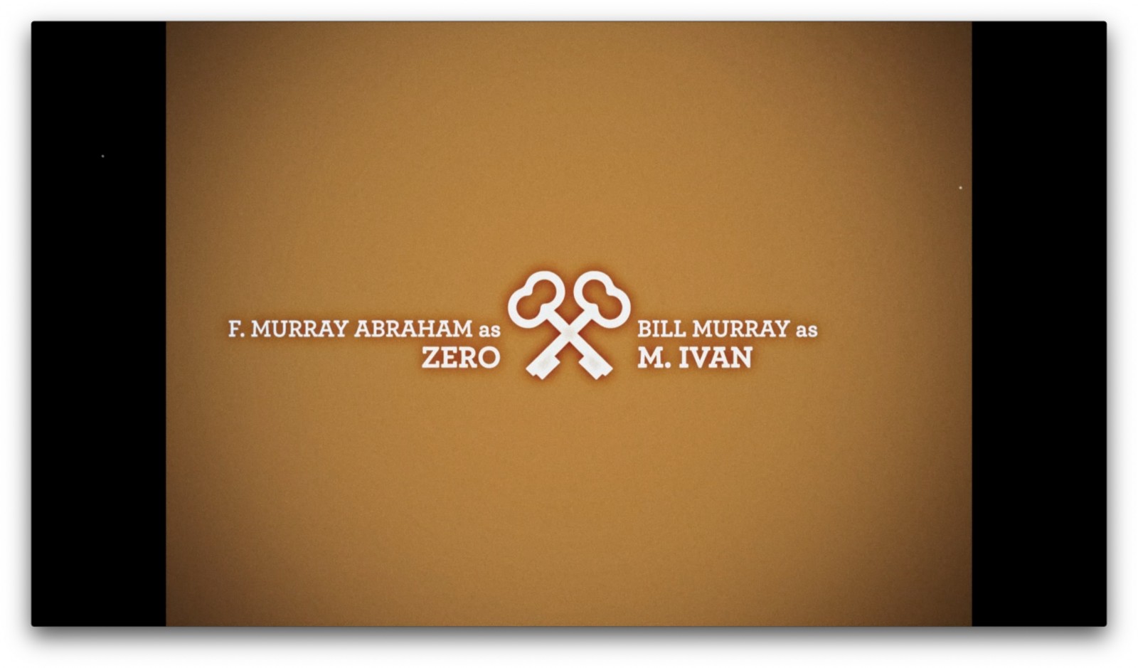
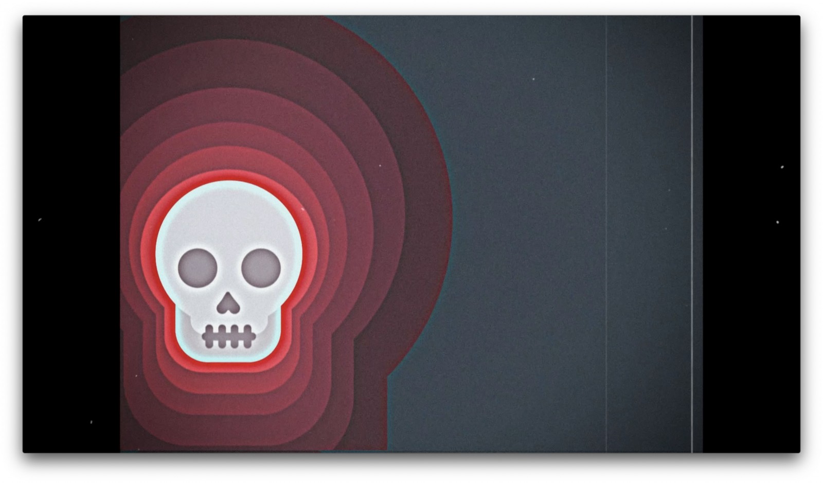


Title sequences aren’t going anywhere. And these days, with TV and film viewership on the rise as people seek out escapes and fresh windows on a locked-down world, we have the opportunity to recapture attention, and to think about how we can create engaging, delightful, and unskippable title-sequence experiences for viewers. The best television title or movie title sequences have historically interacted with viewers and their relationship to the show or movie on some level. Think about season-to-season changes, locations, and themes, one-off sequences for holiday specials, or inside jokes. The Simpsons’ intro on a parody of Mad Men comes to mind.
I had a similar theory in mind while working on the title sequence for The Grand Budapest Hotel. I wanted something that viewers would look back upon and realize how the film title told me what’s to come before the film even began, a callback of sorts. I ventured into the realms of typography, iconography, and even stop-motion to get something close to Wes Andersons’ style. But the direction of Wes Anderson called for something with a little more pizzazz, along with a very well thought out color palette which increasingly goes darker as the movie progresses. Taking in account the camera movements and the different aspect ratios that he uses so perfectly. Most of the movie is about the past and happens on a 4:3 aspect ratio, then the present is in anamorphic lens 2.33:1.
Wes Anderson goes to great lengths to make his movies with all his elaborative sets, casts, dresses and the fictional places. He really wants you to see the world from his eyes and I wanted to keep that “movie magic” alive. The film title is based around the chaos that happens in the movie. The characters names, each, are wrapped in their own beautifully curated illustrations which come alive during the course of time. Each character is unique to Wes Anderson and so is their introduction in the film title. The transitions are also a part of the camera technique that Anderson is so associated with. Titles end with an anamorphic lens which is how the movie begins. The color theme in the titles is based on the color theme in the movie, the greyscale towards the end is also symbolic of what happens during the end of this 1 hour 39 minutes saga.
I found it particularly interesting that Wes Anderson didn’t have a film title for his movie, as elaborative as his movies are one would definitely expect a film title which you wouldn’t want to skip even if you were running late.
I see title sequences as an opportunity to bring narrative design and branding together to tell a story and design experience about the main event that follows the title. An unskippable element of the creative process that turns a show or film into a recognisable brand and contributes to an experience that resonates long after the closing credits roll. This is what I wanted to bring to the forefront, hope you enjoy it.