

Assignment 1_2: Responsive Layouts with Text and Lines
Due for review (beginning of class) Tuesday, Sept 24, beginning of class (design), Tuesday, Sept 29, beginning of class (coding).
We'll be adding lines to the compositions. Lines shouldn't be simply used for the purpose of decoration.
Lines should rather be used to:- Enforce/enhance visual hierarchy (combined with headlines, for example)
- Separate or highlight information/sections
- Visually group information/sections
Lines can have different weights and length in a composition. Use the grid measurements for the width of lines that are applied to new elements (other than already existing h1, h2, h3,, p, ul, li, span or div elements.

Restrictions and Rules
Same as in previous assignment (no color, just black, no shapes, only 1 font (Proxima Nova).
CSS styles for this assignment
Write the CSS rules using so called short-hand border properties. In the case of lines it's a combination of thickness, kind and color values. For now, only use the "solid" kind with different thicknesses .
In the first example below the border is applied to each side of the h1 element. In the second example the border is applied only to the top side. If you don't define a side the border will be allied to all sides (third example). The fourth example is identical with the third but doesn't use the short hand property (combined properties and values = more code).
Task
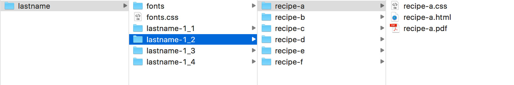
As a start pick one of the previous compositions. The create five responsive compositions with added lines using the Illustrator template. Once you start coding, make sure you start new HTML and CSS files for each of the composition. Just like in the previous assignment I recommend to make Illustrator/PDF versions of the layouts first (use the three-size template again). I'd like to collect the Illustrator version of the layout for reference. Put the .ai file into the same folder as the HTML and CSS files. As in 1_1 we only code one of the five variations.
Upload/update you site folder containing PDFs and coded files in Box.
Due for review Tuesday, Oct 10 (beginning of class).
Tips
- Don’t mix up too many different sizes and weights
- Avoid centering elements
- Combine different proportions
- Create contrast (big/small, thin/bold, tight/open, narrow/wide..)
- Group chunks of information and look for relations between those groups (sizes, spaces, alignments)