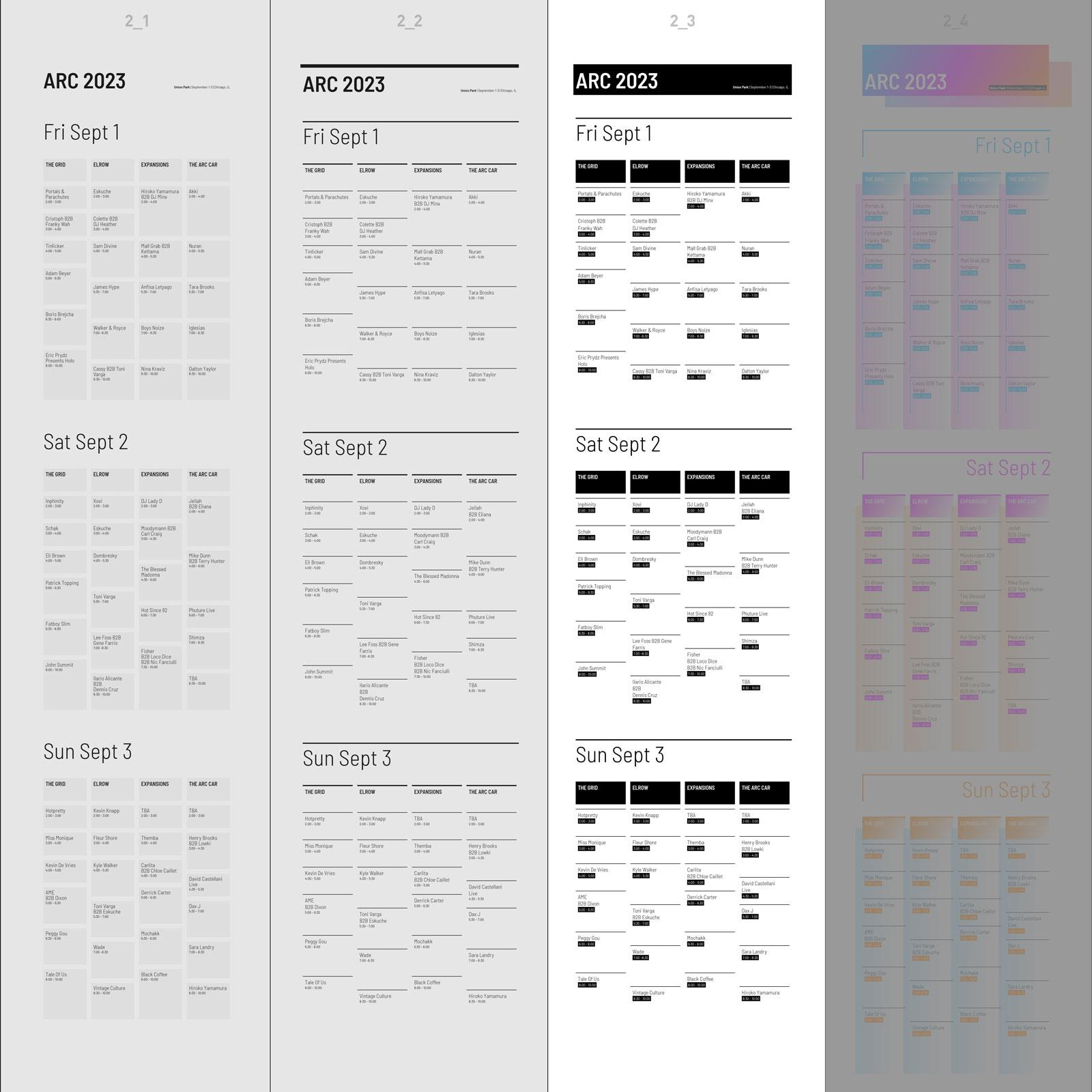
2_3: Responsive Grid Layout: Adding Shapes

Design due: Thursday, Sept 22 / Coding due: Tuesday, Sept 27
We'll be adding shapes/background color to the compositions. Shapes shouldn't be simply used for the purpose of decoration.
Shapes/backgrounds should rather be used to:- Enforce/enhance visual hierarchy (combined with headlines, for example)
- Separate information/sections
- Visually group information/sections
Restrictions and Rules
Same as in previous assignment (no color, just black and white, 1 font (Proxima Nova). Shapes here are technically speaking background-color declarations in CSS. The backgrounds are "naturally" rectangular or square, no other kind of shape should be used at this point. The background-color declarations can be applied to elements such as h1, h3, h3, p, span, div etc.
CSS
Write the CSS rules witch background-color declarations. If necessary, add div elements to the HTML for additional spacing options.
Background-color example (each of the value examples result in a black color, there are just different ways to define a color in CSS):
Task
As a start, pick one composition from 1_2 and create three responsive compositions using text, lines and shape/background. It's fine to make adjustments to the existing compositions (take elements such as lines out or add new ones).
Make sure you start a new HTML and CSS file for the composition (in a new folder!).
Your Box folder would now look like this:


