

Responsive Design: Recipe Layouts
You'll be creating a number of layouts using a dish recipe. These layouts should be designed and coded responsive which means that the layout adjusts to different screen sizes. Start with a mobile/smartphone size and then make decisions on how this layouts needs to adjust/respond to bigger screens (tablet, laptop, big screen).
We'll be designing directly "in the browser" using Adobe Dreamweaver as a code editor. If it helps, sketches can be made with pencil on paper, of course. But we won't create the designs in a layout program first. Coding the design right from the start will allow you to learn about the possibilities and restrictions of HTML markup together with CSS style sheets. Since most of you won't have a lot of experience with coding, accidents or mistakes may happen. Since you can see the result right away some of those accidents could lead to a new idea. Keep your eyes and mind open and investigate, understand and react to what you see in the browser.
Layout Sizes
There are many devices available nowadays in all kinds of sizes. To simplify this task a bit we'll be focusing on 3 device sizes:
- - Smartphone: 375 x 667p (iPhone 7)
- - Tablet: 768 x 1024p (iPad Mini, iPad Air)
- - Desktop: 1280 by 800p
Your layout should be optimized for those sizes. Optimization includes, for example, changing font sizes, floating columns (side by side elements), adding or deleting elements such as lines/borders, background-colors etc. Focus on legibility, hierarchy of information, composition.
Use the Safari browser for this assignment together with the "Develop" menu. This menu allows to imitate the above mentioned devices in the browser. If you don’t see the Develop menu in the menu bar, choose Safari > Preferences, click Advanced, then select “Show Develop menu in menu bar.”
Fonts
We'll be using Proxima Nova (all weights, regular or/and condensed). You can download the Proxima Nova webfonts here. For more about webfonts read this article (For this assignment we'll be embedding fonts using the @Font-Face Rule).
Number of layouts and variations to design/code
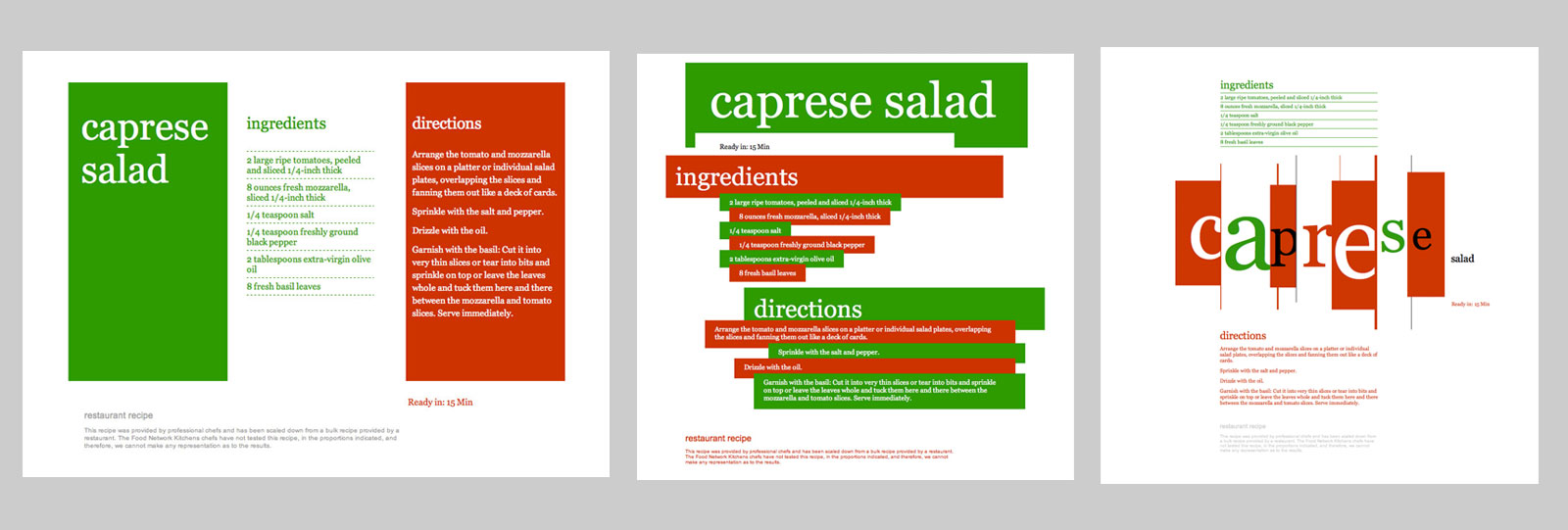
1_1: Layouts using just text. Six variations in compositions, type sizes and weights.
1_2: Layouts with text + lines. Pick two of the results from 1_1 and make 3 variations each using lines as an additional design element.
1_3: Layouts with text + lines + shape. Pick two layouts from 1_2 and make 3 variations for each design using shapes as additional elements.
1_4: Pick one layout from 1_3 and make 3 variations using CSS3 features such as gradients and rounded corners.

Organization
A lot in web design has to do with organization:
- If the design appears organized, the information is easier and quicker to take in
- if the code files are organized you can work quicker and find mistakes a lot easier
- good organization in files and folder structure keeps (hyper)links between them simple
Create a folder which contains 1 sub-folder for each recipe layout and another sub-folder containing the font files. At this point it's not necessary to add HTML and CSS files to the folders yet, but the empty folders should exist prior to starting the Dreamweaver project. Later we'll add the "fonts.css" file to the main directory (more about this here).
The images below shows the final organization of files and folders related to the diagram above. Use your last name in combination with the assignment number for main directory/folder. Dreamweaver refers to this later as the "Local Site Folder" (containing all of your coded files, fonts, HTML, CSS).


