

Mobile Menu Example
One navigation method that is often used for responsive designs is the menu that will initially be hidden on a mobile device and can be revealed with a tap on a button. I setup a simple, one level navigation menu that can relatively easy be (visually) modified with CSS.
Option 1
Hidden on desktop and pull down menu on mobile devices
You can download the source code by clicking here. Keep in mind that this setup is a combination of HTML, CSS, JavaScript and one image. The JavaScript is at the bottom of the HTML but the CSS is in a separate file (style.css in CSS folder). You also need to copy the CSS to your own portfolio CSS file. Also copy the image (button) to your images folder.
Desktop: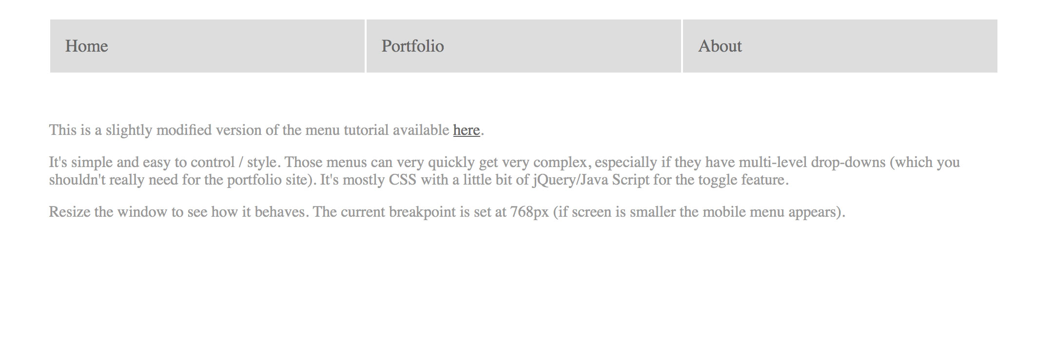 Mobile:

Below you can see where the Java Script is placed:

Option 2
Menu is already hidden on desktop

Download here.