Responsive Design: Recipe Layouts
You'll be creating a number of layouts using a simple recipe for a dish or beverage. These layouts should be designed and coded responsive which means that the layouts adjust to different screen sizes. No matter what screen size you're viewing the page with, the layout should always be legible without the need of zooming in or out. Although elements will need adjustments to "work" on the different sizes (font size change, spacing, re-ordering etc.) the overall layout concept/idea/design should be similar. In other words: The page visitor should feel that he/she are viewing the same web page, no matter which device they're using.
You can either start with a mobile/smartphone size and then make decisions on how this layouts needs to adjust/respond to bigger screens (tablet, laptop, big screen or vise versa, start with the big screens first and make decisions on how things need to adjust for smaller devices.
In the beginning we'll be creating the compositions first in a layout program (Illustrator) before we code them. But with some practice you may be able to directly create them in the browser, meaning working with code right away. We'll be using Adobe Dreamweaver as a code editor. Coding the designs will make you aware of the possibilities and restrictions of HTML markup together with CSS style sheets.

Layout Sizes
There are many devices available nowadays in all kinds of sizes. We'll be checking the appearance of the layout on 3 device sizes:
- - Smartphone: 375 x 667p (iPhone 7)
- - Tablet: 768 x 1024p (iPad Mini, iPad Air)
- - Desktop: 1280 by 800p
Your layout should be optimized for those sizes. Optimization includes, for example, changing font sizes, floating columns (side by side elements), adding or deleting elements such as lines/borders, background-colors etc. Focus on legibility, hierarchy of information, composition.
Use the Safari browser for this assignment together with the "Develop" menu. This menu allows to imitate the above mentioned devices in the browser. If you don’t see the Develop menu in the menu bar, choose Safari > Preferences, click Advanced, then select “Show Develop menu in menu bar.”
Process
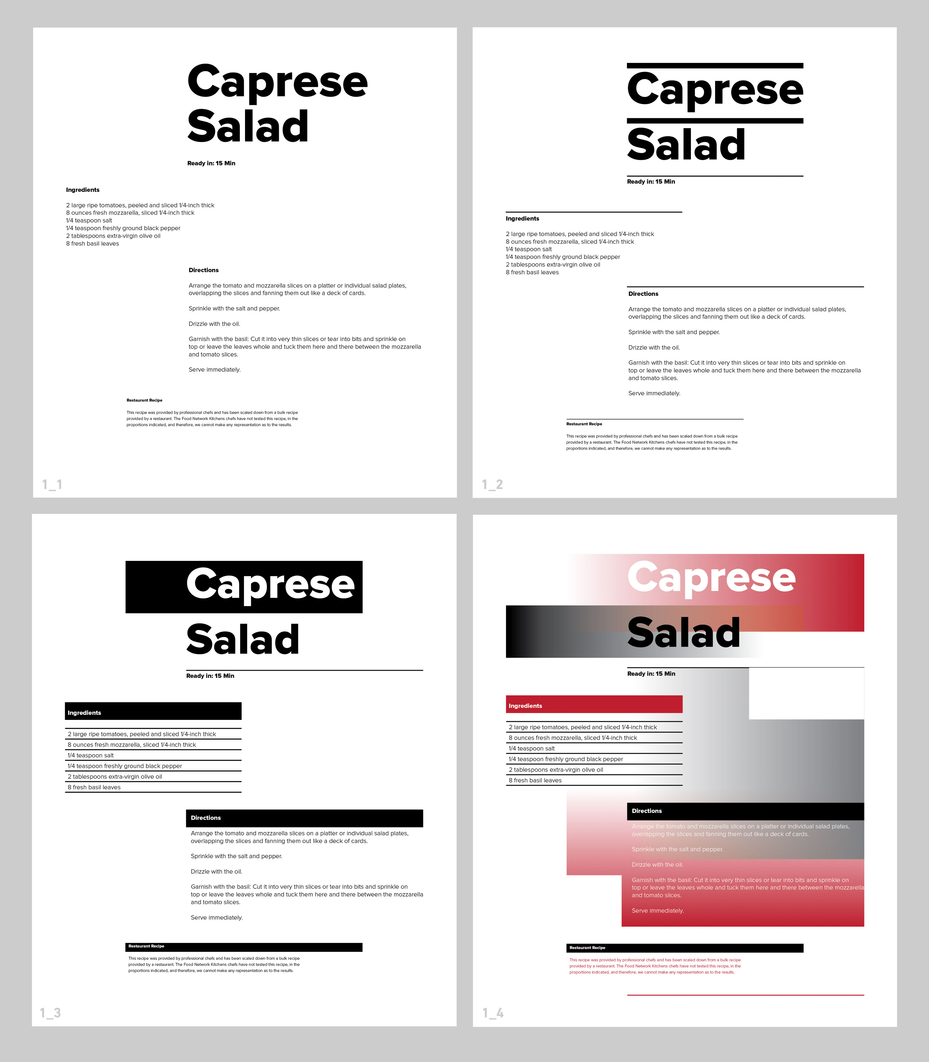
The example below shows the overall design process. We start with a layout on a grid using text only (1_1). Then we add lines (1_2), lines and shapes (1_3) and then lines, shapes and color (1_4).
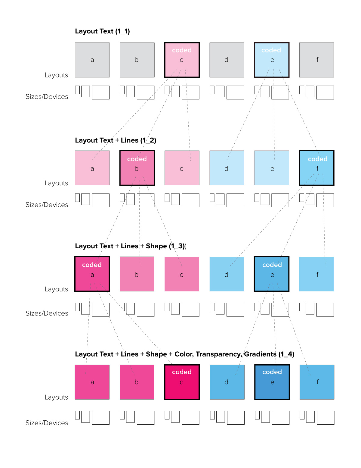
Number of layouts and variations to design/code
1_1: Layouts using just text. Six responsive compositions (placement, type sizes, weights) Six layouts in Illustrator, saved as PDFs. Two layouts coded.
1_2: Layouts with text + lines. Pick two of the results from 1_1 and make three variations each using lines as an additional design element. Six layouts in Illustrator, saved as PDFs. Two layouts coded.
1_3: Layouts with text + lines + shape. Pick two layouts from 1_2 and make three variations for each design using shapes as additional elements. Six layouts in Illustrator, saved as PDFs. Two layouts coded.
1_4: Layouts with text + lines + shape + color (with transparencies, gradients). Pick two layouts from 1_3 and make three variations for each design using color as an additional element. Six layouts in Illustrator, saved as PDFs. Two layouts coded.
Organization
A lot in web design has to do with organization:
- If the design appears organized, the information is easier and quicker to take in
- if the code files are organized you can work quicker and find mistakes a lot easier
- good organization in files and folder structure keeps (hyper)links between them simple
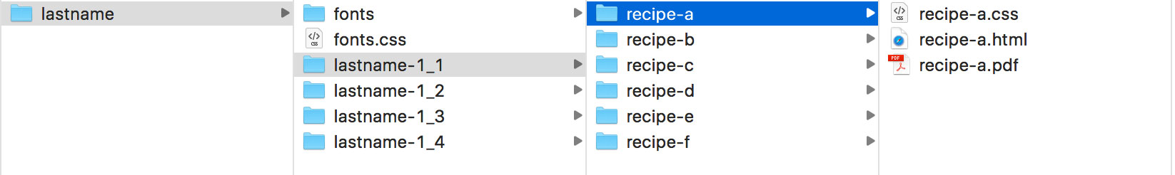
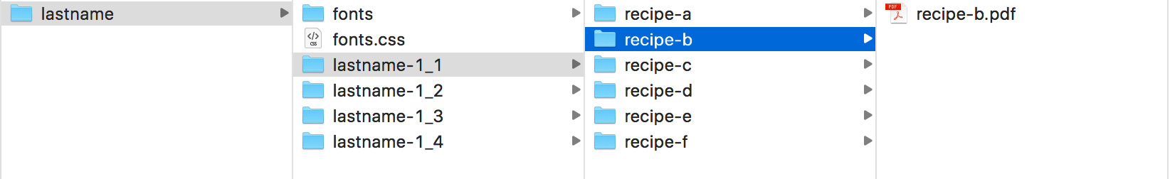
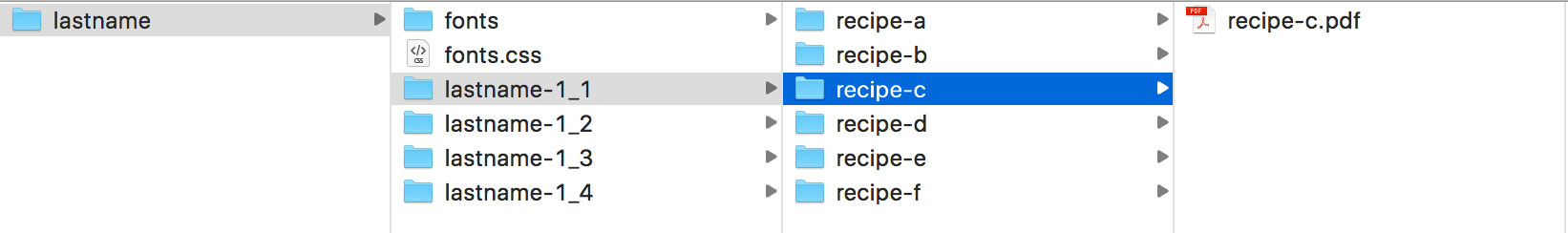
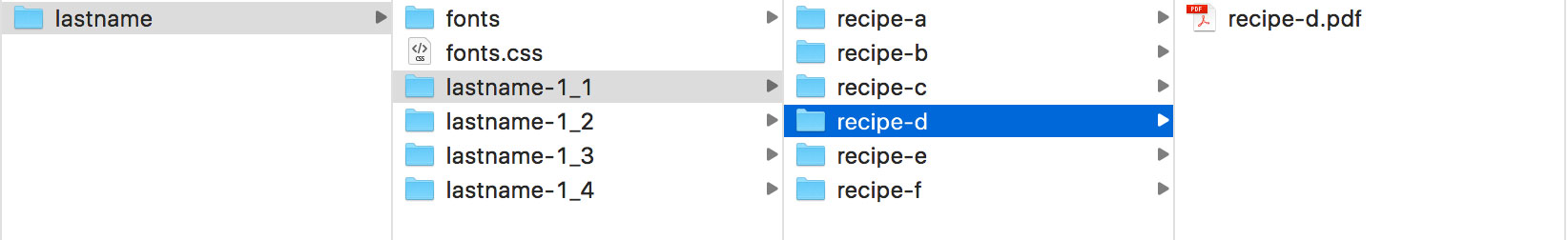
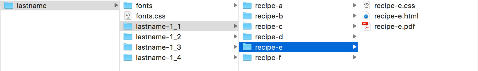
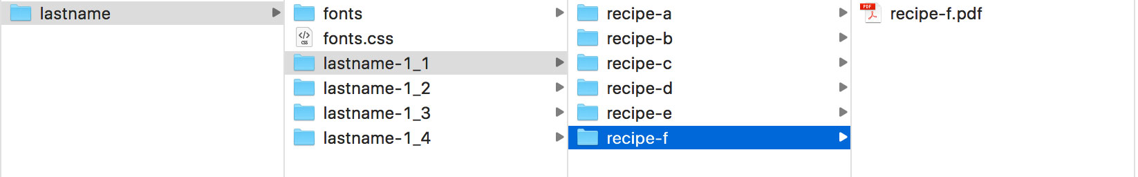
The images below shows the final organization of files and folders for assignment 1_1 (look at the diagram above for reference). Use your last name in combination with the assignment number for main directory/folders. And then "recipe-" plus the letter a-f for the variations. You can see here also that only 2 of the 6 layouts need to be coded (in this example it's layout a and e).