

Assignment 1_1: Responsive Layouts (Text Only)
Due for review Thursday, Sept 13 (beginning of class).
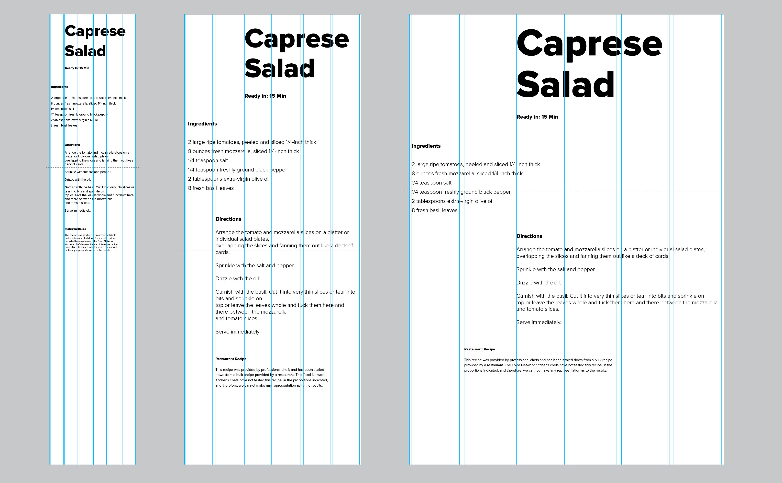
In this assignment you'll create six responsive grid layouts using the recipe text.
Design the layouts first in Illustrator. Download one of the following templates. They are identical, just different formats:
Illustrator CC
Illustrator CS5
Illustrator PDF
It contains 3 art boards, one for smartphone, one for tablet and one for desktop sized screens. Each template counts as one responsive design/layout.
Fonts
You already downloaded the web fonts. In order to use the font (Proxima Nova) in Illustrator you need to install the desktop fonts first which are available for download here.
I encourage to create designs directly in the browser later on once you get more experienced with coding. But for now we start with the Illustrator designs. Even later on having Illustrator files as a reference will help to clarify what you're intensions are in case you run into issues with the coding.
Design
Focus on the following:
- Typography
- Composition
- Visual Hierarchy
- Legibility
- Contrast (sizes, weights, spacing)
- How do font sizes, weights, spaces relate to each other
- Consistent relations help overall organization (vs. randomness)
- Grouping of text information
- Uniqueness of layouts amongst each other
The "tools" you have available for now are:
- Font size
- Font weights
- White space
- Line spacing
- Text alignment
Since we design for multiple screen sizes think about this as a design system with certain conditions rather than a (static) layout in a traditional sense. Ask yourself the following questions:
- What do I need to do in order to make the pieces of information distinguishable?
- How can I create hierarchy?
- What are the minimum requirements/conditions to achieve this?
- Which widths do I need to adjusts inside the grid when the screen size changes, Which font sizes need to change?
With responsive design the goal should be to keep the layout idea consistent across multiple screen sizes. Although the layout will certainly need adjustments, it should not look like a different design when viewed on another screen size.
Example: When I'm using font weights to define information such as headlines and paragraphs (create hierarchy), do I really need to use different font sizes additionally or can I just design with the font weights only? Do I need to use ("white") spaces to separate information? What are my options?
The Grid
The Illustrator template has a layer with guides representing the layout grid. We'll be working with a responsive 6 column grid. The width of a grid column (or combined column widths) together with the spaces between the columns (margins) determines where things should be placed, how large the font can be etc.
As you can see in the example below certain design decisions have to be made in order to "make the layout work" on the different screen sizes. On thing that probably needs to be adjusted are font sizes. Even on a smaller smartphone the text should be legible without having to zoom in. Text should be smaller than 12px.
Variations
Develop six unique layouts. But we'll only be coding two of those (I'll help with choosing them). Try different things. Be bold. Go explore the extremes (contrasting big and small text, heavy and light, dense and sparse, simple and complex, etc.).
Restrictions
Exploring design possibilities systematically is really only possible within certain given restrictions and rules. Playing with possibilities within constrains are more likely to produce unpredictable or "unimagined" results. Restrictions or constraints also help to create visual order (instead of chaos).
- Black and White only, no grays or transparency (yet)
- Proxima Nova Font (all available weights)
- No Images
- Just text (no background-colors, lines/borders etc.)
- Only horizontal type. No rotations or vertical arrangements (more difficult to code)
Rules
Within our restrictions we can assign ourself certain rules for experimentation. Our goal is to create contrast and hierarchy. Define the rules before you design. Be prepared to tell me what those rules are for each composition. Examples:
- Use only font sizes (no weight differences) and spacing in composition.
- Use only font weights and spacing (no different font sizes).
- Only one font size and weight, use line space, word space and white space to create hierarchy and contrast.
- Combine three font sizes, only use two font weights (light and black, for example).
- ...
Screen/Device Sizes
- Smartphone: 375 x 667p (iPhone 7)
- Tablet: 768 x 1024p (iPad Mini, iPad Air)
- Desktop: 1280 by 800p
There are more and more screen sizes available (big smartphones, small tablets...) and designing for specific product sizes is not practical anymore. The three sizes mentioned above are average screens sizes that will help us make certain design decisions.
The Safari browser has a "Develop Tab" that include a "Responsive Design Mode". If active, you can choose between apple phones, tablets and desktop screen sizes and the browser size will adjust itself to the device selected. That's an easy and quick way to view/test your layout on your computer.
CSS Declarations for Assignment 1_1
Example: The rule below is styling a headline with four declarations combined: font-size, width, margins and letter-spacing.
CSS code:
h1 {<br>
  font-size: 32px;<br>
  width: 46%;<br>
  margin: 4% 0% 4% 33.33%;<br>
  letter-spacing: 2px;<br>
}<br>
The first part of Assignment 1 is to create different compositions with just text. You can use the CSS declaration listed below for styling.
- font-size
- font-family
- letter-spacing
- line-height
- text-transform (capitalize, uppercase, lowercase)
- text-align (left, right, center, justify)
- word-spacing
- margin (space between elements)
- padding (space between text and edge of element)
- vertical-align (alignment of text element within another text element)
- float (left or right; used to make elements appear side by side)
- display (block, inline-block; used to make block elements behave like non-block elements, or non-block elements behave like block elements)
font-family: 'ProximaNovaThin';<br />
font-family: 'ProximaNovaLight';<br />
font-family: 'ProximaNovaRegular';<br />
font-family: 'ProximaNovaSemibold';<br />
font-family: 'ProximaNovaBold';<br />
font-family: 'ProximaNovaExtrabold';<br />
font-family: 'ProximaNovaBlack';<br />
<br />

font-size: 20px;<br />
<br />

line-height: 20px;<br />
letter-spacing: -2px;<br />
word-spacing: 20px;<br />
text-transform: uppercase;<br />
text-align: right;<br />
<br />


margin-top: 2%;<br />
margin-right: 2%;<br />
margin-bottom: 2%;<br />
margin-left: 2%;<br />
margin: 2% 2%x 2%x 2%;<br />
<br />

padding-top: 2%;<br />
padding-right: 2%;<br />
padding-bottom: 2%;<br />
padding-left: 2%;<br />
padding: 2% 2% 2% 2%;<br />
<br>

width: 25%;<br>
<br>
float: right;<br>
float: left;<br>
<br>

list-style-type: circle;<br>
<br>
You can find a full list of properties on the w3schools.com site.
Don't use the following declarations:
- font-weight (not necessary since we're using font-families
- font-variant (small caps are bad if font is not designed for that use!)
- font-style (not oblique of italics yet, part of the restrictions)
CSS Selectors for Assignment 1_1
CSS code:
h1 {<br>
  property: value;<br>
}<br>

h2 {<br>
  property: value;<br>
}<br>

h3 {<br>
  property: value;<br>
}<br>

p {<br>
  property: value;<br>
}<br>

ul {<br>
  property: value;<br>
}<br>

li {<br>
  property: value;<br>
}<br>

span {<br>
  property: value;<br>
}<br>

#div-id-name {<br>
  property: value;<br>
}<br>

.class-name {<br>
  property: value;<br>
}<br>


<br><br>
CSS measurements: Fixed pixel values vs percentage based values
Percentage values for element widths make often more sense than fixed pixels values (in the CSS). For example if the distance between a paragraph and the edge of your browser is defined with percentage values it will appear relatively similar, no matter if you're viewing on a small or big screen. On the other hand, if you would use pixel amounts and apply the desired distance to small phone layout it may look to narrow on a bigger screen. If you use percentage values, especially for all the horizontal measurements you don't need to adjust as many values for the different screen sizes.
It's often better not to specify heights for elements that contain text. Paragraphs, for example, do get more narrow on smaller screens which means they need more height to contain all text. The elements' heights automatically adjusts to the amount of text in them. You would eventually run out of space if you would define a height.

The layout width is 100%. 100% : 6 = 16.66% which would be one column width without margins. If we calculate in 2% margin on each side of the column it's width is 12.66%.
So 2% + 12.66% + 2% + 2% + 12.66% + 2% + 2% + 12.66% + 2% + 2% + 12.66% + 2% + 2% + 12.66% + 2% + 2% + 12.66% + 2% = 100%
To determine with width of the title we can look at the layout and count the column which is 3. 3 x 16.66% = 50%. Subtracting the 2% margins on each side we'll end up with 46%.
If there would be another element next to the title that's 2 columns wide it would be 29.33%. But if we just need to determine the distance between the title and the left side of the layout the calculation is 2 x 16.66% = 33.33%.
Below the CSS:
CSS code:
.one_col {<br>
  width: 12.667%;<br>
  margin: 2%;<br>
  float: left;<br>
}<br>
.two_col {<br>
  width: 29.333%;<br>
  margin: 2%;<br>
  float: left;<br>
}<br>
.three_col {<br>
  width: 46%;<br>
  margin: 2%;<br>
  float: left;<br>
}<br>
.four_col {<br>
  width: 62.666%;<br>
  margin: 2%;<br>
  float: left;<br>
}<br>
.five_col {<br>
  width: 79.333%;<br>
  margin: 2%;<br>
  float: left;<br>
}<br>
.six_col {<br>
  width: 96%;<br>
  margin: 2%;<br>
}<br><br>
Coded, Responsive Grid Example/Demo
Click this link to see a fluid, responsive grid "in action". Resize the browser window to see how some of the columns respond to smaller windows.

CSS Media Queries (Desktop First Example)
CSS example:
.h1 { font-size: 200px; }<br><br>

<span class="light-blue">@media (max-width: 768px) {</span> <br>
   h1 { font-size: 100px; } <br>
<span class="light-blue">}</span> <br><br>

<span class="light-blue">@media (max-width: 360px ) {</span> <br>
   h1 { font-size:50px; } <br>
<span class="light-blue">}</span> <br><br>

<br><br>
Recources
Read the article about CSS Basics carefully.
Also read this article about Media Queries (define screen sizes where style changes happen).
This PDF I prepared will help you during this assignment. .
Submitting Files
Upload/update your site folder in Box. Al together there should be six compositions as PDF files and two of them coded (HTML + CSS).

Further Readings (CSS Basics)
Download and read this PDF with an excerpt about CSS Basics from the book "HTML & CSS – design and build websites").
Further Readings (Process, Design, Composition)
Working with Constraints
Graphic designers have used modular elements to produce unpredictable results. Try looking at familiar systems from a fresh angle. Given the constraints of any system, how can you play with the rules to make something new?
A child’s set of alphabet blocks looks a certain way, for example, because the blocks are made from perfect cubes. But what if alphabet blocks were made from rectangles instead of cubes? The oddly proportioned faces of the blocks at left provided a framework for designing new letterforms in response to the constraints provided by the blocks of wood.
Standard materials such as laser paper are often used in generic ways. A standard sheet of office paper can be very dull indeed. Yet with creative thinking, an ordinary piece of paper can be used for dramatic effect.
Variations
Variation involves change—the vitality of transformation, in contrast to constancy —the fixity of the invariable. In music variation means the mutation of a musical idea, the transformation of a theme or a mean value. Variation involves singling out a mean value and calls for the ability to put this mean value through as many transformations as possible.
The aim is to devise hundreds of arrangements while adhering strictly to the theme in question, and it is a good plan to sketch out these various ideas in preprinted squares. Elementary exercises like these help the typographer to develop versatility and the ability to see a given theme in a multitude of different ways and to tackle it from different angles.
—Emil Ruder
Proportions
Every means at the disposal of man in his creative activities has its value and its extent. In architecture we have the surfaces which enclose space and the volume thus enclosed. Typography is restricted to two-dimensional space. Even with a single value the problem of proportion still arises, for the relationship of length, breadth and depth has to be settled. Once a plurality of means is used, the real problem of proportion must be faced: the organization of several things in a certain relationship of size.
For centuries, from the number mysticism of the Middle Ages, through the proportional systems of the Renaissance, down to Le Corbusier’s module, man has endeavoured to subject objects of different dimensions to certain rules and fixed numerical systems. These efforts have had two results: Work created out of feeling and intuition and subsequently subordinated to a numerical pattern has been erroneously placed with works constructed on a principle reached by calculation. More important, however, is the fact that proportional systems based on calculation have barred the way to creative work; they have become crutches to support the incompetent. Le Corbusier’s module came at the end of a long, creative life, rich in experience and insights; but for the young student of architecture the same module is a pitfall and a hazard. Ostwald’s extensive efforts to number all colours and to bring the “right” colours together has made no contribution whatever to a real colour culture.
No system of ratios, however ingenious. can relieve the typographer of deciding how one value should be related to another. He must first recognize the individual value before he can work with it. He must spare no effort to tutor his feeling for proportion so that he can judge how much a given ratio can bear. He must know intuitively when the tension between several things is so great that harmony is endangered. But he must also know how to avoid relationships lacking in tension since these lead to monotony. Whether the tension should be strong or weak is a decision which the typographer must make for himself in the light of the problem he is seeking to solve. This is an argument against a rigid numerical principle such as the Golden Section of 3:5:8: 13, for this principle may be right for one work but wrong for another.
Typographical design calls for the recognition of values which become visible during the setting process and have to be organized according to the following criteria: What is the relationship between one value and another? How is a given type size related to a second or third ? What are the relations between the printed and unprinted areas? What is the relationship between the colour value and quality and the grey of the type matter? How do the various tones of grey compare? The proper observation of these principles is crucial for the beauty of a printed work, and for its formal and functional qualities.
—Emil Ruder