

Assignment 1_1: Borders 1
In your site folder (as described here) create a new folder called "assignment-1-1". For each assignment we start with the grid document we already created ("assignment-grid.html"}. Open this file up and save it under a different name ("1-1-01.htm"l} into the new folder. Important is not so save over the initial grid document. Keep it as a starting template for the upcoming assignments. I'll present the 2 articles about HTML and CSS basics. Please make sure to read those in case you missed class.
Create CSS rules and apply classes to the HTML markup
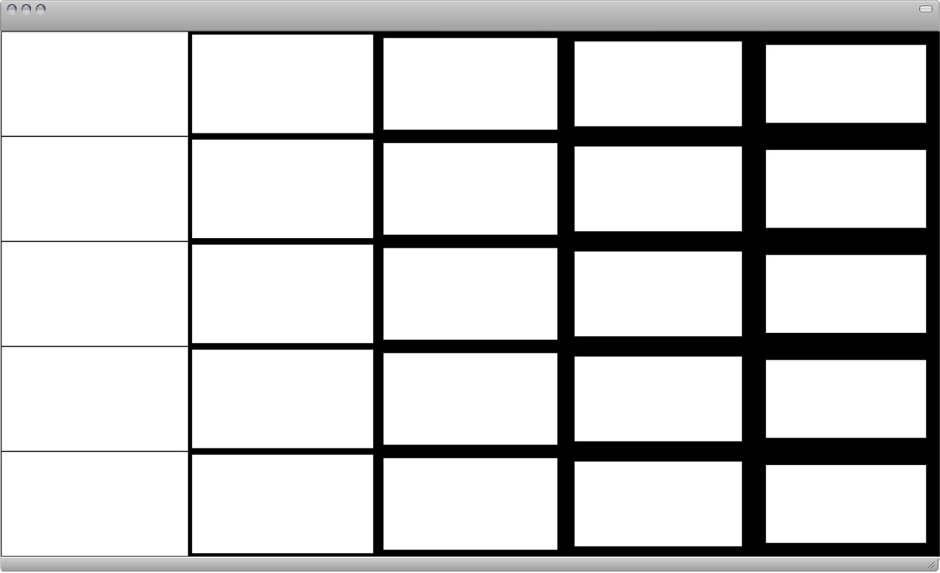
First you need to adjust the link to the CSS file. If you're using Dreamweaver it may have happened automatically already. Since the first assignment page is in a subdirectory (folder "assignment-1-1", the link to the CSS changes. It needs an additional "../" in the beginning. The CSS example below ads 5 new rules to the existing file. Each rule will apply a different border width to and element. In order to easily identify which rule does what it makes sense to have the value in the class name. ".borders-10", for example, will apply a 10 pixel border to a div element. You'll add those classes to the elements in your HTML markup in order to achieve a certain result (task described below).
HTML code:
<!doctype html><br />
<html><br />
<br />
<head><br />
<title>Grid</title><br />
<span class="pink"><link href="../css/styles.css" rel="stylesheet" type="text/css"><br /></span>
</head><br />
<br />
<body><br />
</body><br />
<br />
</html><br />
/* borders for all sides: */ <br />
.borders-01 { border: 1px solid #000; } <br />
.borders-05 { border: 5px solid #000; } <br />
.borders-10 { border: 10px solid #000; } <br />
.borders-15 { border: 15px solid #000; } <br />
.borders-20 { border: 20px solid #000; } <br />
<div class="column-20 height-20 borders-01"></div><br />
<div class="column-20 height-20 borders-05"></div><br />
<div class="column-20 height-20 borders-10"></div><br />
<div class="column-20 height-20 borders-15"></div><br />
<div class="column-20 height-20 borders-20"></div><br />
<br />
<div class="column-20 height-20 borders-01"></div><br />
<div class="column-20 height-20 borders-05"></div><br />
<div class="column-20 height-20 borders-10"></div><br />
<div class="column-20 height-20 borders-15"></div><br />
<div class="column-20 height-20 borders-20"></div><br />
<br />
<div class="column-20 height-20 borders-01"></div><br />
<div class="column-20 height-20 borders-05"></div><br />
<div class="column-20 height-20 borders-10"></div><br />
<div class="column-20 height-20 borders-15"></div><br />
<div class="column-20 height-20 borders-20"></div><br />
<br />
<div class="column-20 height-20 borders-01"></div><br />
<div class="column-20 height-20 borders-05"></div><br />
<div class="column-20 height-20 borders-10"></div><br />
<div class="column-20 height-20 borders-15"></div><br />
<div class="column-20 height-20 borders-20"></div><br />
<br />
<div class="column-20 height-20 borders-01"></div><br />
<div class="column-20 height-20 borders-05"></div><br />
<div class="column-20 height-20 borders-10"></div><br />
<div class="column-20 height-20 borders-15"></div><br />
<div class="column-20 height-20 borders-20"></div>
Task: Create variations
You can use the CSS rules as seen in this example or create more CSS rules (with varying border widths). Apply various border widths to the div elements in the HTML markup (as seen in the example above). All arrangements/compositions should progress from light to dark. Create 5 compositions (5 separate HTML documents).
Further Readings
In this course fundamental concepts and design processes are developed in elementary exercises that require creative decisions. Clearly determined conditions are manipulated, analyzed, and developed over a period of time, using simple graphic media. An understanding of the entire working process is the result.
—Manfred Maier
Line
Klee and Kandinsky state that the line starts from the dot. Klee: “I begin where all pictorial form begins: in the dot which starts to move.” Everything is movement: the dot moves and gives rise to the line, the line moves and produces a plane surface, and plane surfaces come together and create a body.
—Emil Ruder
A point marks a position in space. A series of points forms a line. A mass of points becomes texture, shape, or plane. Tiny points of varying size create shades of gray.
A line is an infinite series of points. Understood geometrically, a line has length, but no breadth. A line is the connection between two points, or it is the path of a moving point. A line can be a positive mark or a negative gap, lines appear at the edges of objects and where two planes meet. Graphically, lines exist in many weights; the thickness and texture as well as the path of the mark determine its visual presence, lines are drawn with a pen, pencil, brush, mouse, or digital code. They can be straight or curved, continuous or broken. When a line reaches a certain thickness, it becomes a plane. Lines multiply to describe volumes, planes, and textures.
—Ellen Lupton
In contemporary typography it has become an accepted practice to link all the pages of a single multipage work as closely together as possible. A book must be consistently designed throughout, including the title-page and, if possible, the cover title. The title-page is taken as a model for all the others so that type face, type size, leading, indents, type area, blank spaces, etc. fit into the overall pattern. In the illustrated section, there should be a plan determining the setting out and size of the illustrations, and this should be deviated from only in exceptional circumstances. A book which is designed with the minimum of material acquires unity not merely through the arrangement of the text but also through the homogeneity of the typographical means employed.
Consistency of design can also be achieved by devising an underlying grid pattern to which all the elements must comply. The Abbey of St. Gall was built in the early 9th century on a plan based on the square. In this way every part of the building acquired a fixed relation to the others and was assigned a proper place in the whole; the layout thus conveys an impression of planning and uniform purpose.
A book containing pictures and text based on a grid pattern of nine squares. This pattern is the means of establishing a formal unity between the different amounts of text and different sizes and shapes of picture. The pattern should not be conspicuous in the final result but rather be concealed by the diversity of pictorial subjects and typographical values.
—Emil Ruder