

Assignment 3_2: Background Images / Line Patterns 2
This is a further investigation of the possibilties using the CSS background-image propery. A texture photo should be combined with line patterns. Take advantage of the background-size and background-position properties to and play with those options. Refer to the Images article for details on those properties.
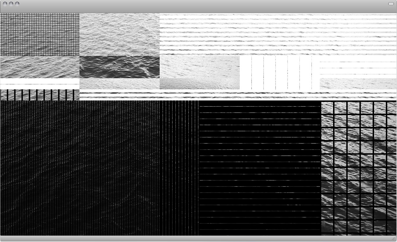
Fixed: 5 rows, 5 columns
Variables: Proportions, background images (black and white lines as well as a texture photo).
Goal: Create visual hierarchy with a focus on either dark or light sections.
Preparing New Images and Patterns
Download and unzip this folder, which contains a selection of texture photos. You can also use your own image but make sure you convert it to greyscale and use the JPG file format. The image shouldn't be smaller than around 1600 x 900px and not larger than around 2400 x 1600px.
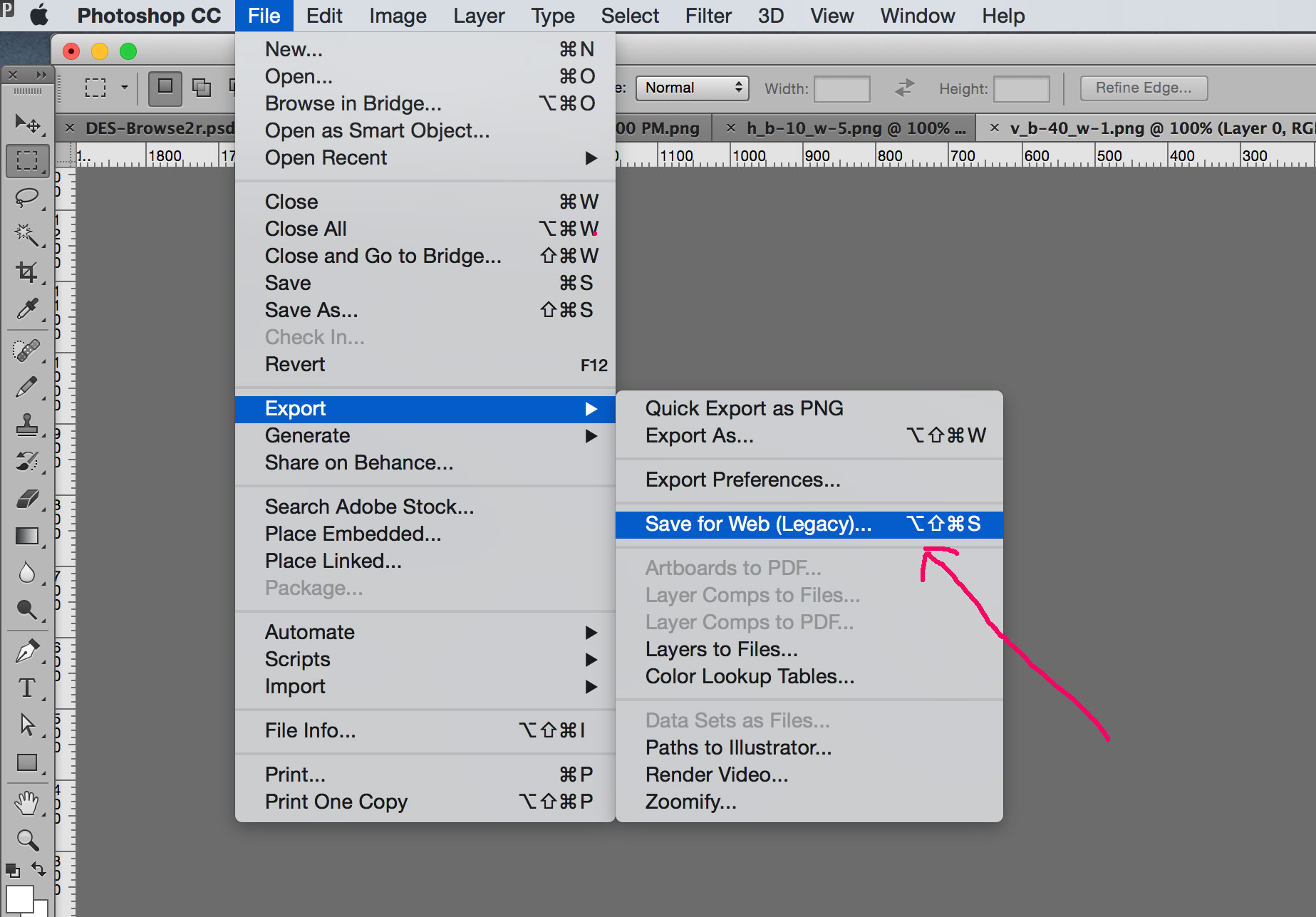
In order to create horizontal lines you need to add a pattern image yourself. The easiest way in this case is to open one of the existing PNG pattern images, rotate it 90 degrees and save it under a new name into your "images" folder. Save those pattern images always as PNG files. PNG files can contain transparent backgrounds and you can layer them (horizontal and vertical lines make a cross-line pattern, for example). In Photoshop use the Save for Web option and select the PNG format.
White line patterns can be created quickly in a similar way: open up an existing (black) pattern image in Photoshop, invert it and save it under a new name (PNG format again).

After you created the additional images for the new (horizontal) patters as well as the white lines you need to create additional rules in your CSS file for those images. Then finally apply those CSS classes to your HTML.
Example CSS code:
/* vertical lines (existing rules from previous assignment): */  <br> <br>
.v_b1-w5 { background-image: url(../images/v_b-1_w-5.png); } <br>
.v_b1-w10 { background-image: url(../images/v_b-1_w-10.png); } <br>
.v_b1-w20 { background-image: url(../images/v_b-1_w-20.png); } <br>
.v_b1-w40 { background-image: url(../images/v_b-1_w-40.png); } <br>
 <br>
.v_b5-w1 { background-image: url(../images/v_b-5_w-1.png); } <br>
.v_b5-w5 { background-image: url(../images/v_b-5_w-5.png); } <br>
.v_b5-w10 { background-image: url(../images/v_b-5_w-10.png); } <br>
.v_b5-w20 { background-image: url(../images/v_b-5_w-20.png); } <br>
.v_b5-w40 { background-image: url(../images/v_b-5_w-40.png); } <br>
 <br>
.v_b10-w1 { background-image: url(../images/v_b-10_w-1.png); } <br>
.v_b10-w5 { background-image: url(../images/v_b-10_w-5.png); } <br>
.v_b10-w10 { background-image: url(../images/v_b-10_w-10.png); } <br>
.v_b10-w20 { background-image: url(../images/v_b-10_w-20.png); } <br>
.v_b10-w40 { background-image: url(../images/v_b-10_w-40.png); } <br>
 <br>
.v_b20-w1 { background-image: url(../images/v_b-20_w-1.png); } <br>
.v_b20-w5 { background-image: url(../images/v_b-20_w-5.png); } <br>
.v_b20-w10 { background-image: url(../images/v_b-20_w-10.png); } <br>
.v_b20-w20 { background-image: url(../images/v_b-20_w-20.png); } <br>
.v_b20-w40 { background-image: url(../images/v_b-20_w-40.png); } <br>
 <br>
.v_b40-w1 { background-image: url(../images/v_b-40_w-1.png); } <br>
.v_b40-w5 { background-image: url(../images/v_b-40_w-5.png); } <br>
.v_b40-w10 { background-image: url(../images/v_b-40_w-10.png); } <br>
.v_b40-w20 { background-image: url(../images/v_b-40_w-20.png); } <br>
.v_b40-w40 { background-image: url(../images/v_b-40_w-40.png); } <br>
 <br><br>

 /* additional horizontal lines as well as white lines: */  <br> <br>
.h_b20-w1 { background-image: url(../images/h_b-20_w-1.png); }<br>
.h_b40-w1 { background-image: url(../images/h_b-40_w-1.png); }<br>
.wh_v_b5-w10 { background-image: url(../images/wh_h_b-10_w-5.png); }<br>
.wh_v_b40-w1 { background-image: url(../images/wh_v_b-40_w-1.png); }<br>
.wh_h_b20-w1 { background-image: url(../images/wh_h_b-20_w-1.png); }<br>
.vh_b1-w5 { background-image: url(../images/v_b-1_w-5.png), url(../images/h_b-1_w-5.png); }<br>
.vh_b5-w40 { background-image: url(../images/v_b-5_w-40.png), url(../images/h_b-5_w-40.png); }<br>
<br>
.water { <br>
   background-image: url(../images/water.jpg); <br>
   background-size: cover; <br>
   background-position: top center; <br>
} <br>
.b-image-1 { <br>
   background-image: url(../images/water.jpg); <br>
   background-size: cover; <br>
} <br>
.b-image-2 { <br>
   background-image: url(../images/water.jpg); <br>
   background-size: 600%; <br>
   background-position: center; <br>
} <br>
.b-image-3 { <br>
   background-image: url(../images/water.jpg); <br>
   background-size: 200%; <br>
   background-position: 50% 0%; <br>
} <br>
.b-image-4 { <br>
   background-image: url(../images/water.jpg); <br>
   background-size: 500%; <br>
   background-position: top right; <br>
} <br>
<body class="water"><br />
<br />
<div class="column-20 height-20 vh_b1-w5"></div><br />
<div class="column-20 height-20"></div><br />
<div class="column-20 height-20 wh_v_b5-w10"></div><br />
<div class="column-20 height-20 wh_v_b5-w10"></div><br />
<div class="column-20 height-20 wh_v_b5-w10"></div><br />
<br />
<div class="column-20 height-10"></div><br />
<div class="column-20 height-10 b-image-2"></div><br />
<div class="column-20 height-10 b-image-4"></div><br />
<div class="column-20 height-10 wh_v_b40-w1"></div><br />
<div class="column-20 height-10 wh_h_b20-w1"></div><br />
<br />
<div class="column-20 height-05 wh_h_b20-w1"></div><br />
<div class="column-20 height-05 b-image-3"></div><br />
<div class="column-20 height-05 b-image-1"></div><br />
<div class="column-20 height-05 wh_v_b40-w1"></div><br />
<div class="column-20 height-05 b-image-4"></div><br />
<br />
<div class="column-20 height-05 v_b5-w20"></div><br />
<div class="column-20 height-05 wh_v_b5-w10"></div><br />
<div class="column-20 height-05 wh_v_b5-w10"></div><br />
<div class="column-20 height-05 wh_v_b5-w10"></div><br />
<div class="column-20 height-05 wh_v_b5-w10"></div><br />
<br />
<div class="column-40 height-60 v_b5-w1"></div><br />
<div class="column-10 height-60 v_b10-w1"></div><br />
<div class="column-10 height-60 h_b20-w1"></div><br />
<div class="column-20 height-60 h_b20-w1"></div><br />
<div class="column-20 height-60 vh_b5-w40"></div><br />
<br />
</body>
Task: Create additional images and CSS Rules for variations
A light to dark hierachy should be present. Look for contrast (big/small, thin/thick, lots of dark/less white, lots of white/less dark, horizontal/vertical, plenty of image/little of image visible). You can create different grey tones with just the background image by playing with scale and positioning within an element. Also keep in mind that you can layer background images to create cross-line patterns in this case.
Since these are already many variables to play around with try not to combine too many different elements. Work with a scale (for example 3 line widths, 3 shades, light/medium/dark...). Try to achieve:
— order instead of chaos
— a visible system, a visible idea/intent instead of randomness
— clarity instead of busyness
— contrasts (light/dark, thin/thick, big/small areas, dense/sparse, horizontal/vertical...)
Work on different ideas and submit 5 final layouts. Due: Tuesday, Sept 27.