

Assignment 4_1: Fonts and Typography
The main goal of this assignment is to create abstract typographic layouts which show a clear visual hierarchy. Using the Latin text provided you will create 10 different typographic layouts in HTML/CSS. You should play with proportion. You don't need to use/fill every grid unit (div) with type. The typeface given is Proxima, you may use Bold and Light and up to five different sizes.
Fixed: 5 rows, columns based on mulitples of 20%, fonts and font sizes
Variables: Widths, heights of rows, height of whole composition, positioning of text
Goal: Create visual hierarchy with typography.
TEXT
Latin text should be formatted to represent:
– a headline/title
– a subhead
– intro copy
– body copy
– footnote/caption
Copy the latin text below:
Lorem ipsum dolor sit amet, consectetuer adipiscing elit, sed diam nonummy nibh euismod tincidunt ut laoreet dolore magna aliquam erat volutpat. Ut wisi enim ad minim veniam, quis nostrud exerci tation ullamcorper suscipit lobortis nisl ut aliquip ex ea commodo consequat. Duis autem vel eum iriure dolor in hendrerit in vulputate velit esse molestie consequat, vel illum dolore eu feugiat nulla facilisis at vero eros et accumsan et iusto odio dignissim qui blandit praesent luptatum zzril delenit augue duis dolore te feugait nulla facilisi. Nam liber tempor cum soluta nobis eleifend option congue nihil imperdiet doming id quod mazim placerat facer possim assum. Typi non habent claritatem insitam; est usus legentis in iis qui facit eorum claritatem. Investigationes demonstraverunt lectores legere me lius quod ii legunt saepius. Claritas est etiam processus dynamicus, qui sequitur mutationem consuetudium lectorum. Mirum est notare quam littera gothica, quam nunc putamus parum claram, anteposuerit litterarum formas humanitatis per seacula quarta decima et quinta decima. Eodem modo typi, qui nunc nobis videntur parum clari, fiant sollemnes in futurum.
Step 1: Write the HTML
The HTML markup should be structured in a meaningful way. Use the appropriate tags to define the pieces of information. Use the h1 tag for the headline, the h2 tag for the subhead, paragraph (p) tags for intro and body copy as well as the footnote. Further use classes to apply different font sizes and styles to the paragraphs.
Step 2: Embed the fonts by using the @font-face rule
Download the fonts folder, unzip it and put the fonts files into your fonts folder (create one if you haven't done it yet). Then link the fonts to your CSS using the @font-face rule as described in this article.
For this assignment we'll be using light and bold versions of the font Proxima Nova. Below are the two @font-face rules for light and bold versions. You can add them into your existing CSS file (usually they'll be placed at the top). The link to the font files need to be correct. Depending on you own files and folder setup they may look slightly different compared to my example.
CSS code:
@font-face { <br>
   font-family: 'ProximaNovaLight'; <br>
   src: url('../fonts/proximanova-light-webfont.eot'); <br>
   src: url('../fonts/proximanova-light-webfont.eot?#iefix') format('embedded-opentype'), <br>    url('../fonts/proximanova-light-webfont.woff') format('woff'), <br>
   url('../fonts/proximanova-light-webfont.ttf') format('truetype'), <br>    url('../fonts/proximanova-light-webfont.svg#ProximaNovaLight') format('svg'); <br>
   font-weight: normal; <br>
   font-style: normal; <br>
} <br><br>

@font-face { <br>
   font-family: 'ProximaNovaBold'; <br>
   src: url('../fonts/proximanova-bold-webfont.eot'); <br>
   src: url('../fonts/proximanova-bold-webfont.eot?#iefix') format('embedded-opentype'), <br>    url('../fonts/proximanova-bold-webfont.woff') format('woff'), <br>
   url('../fonts/proximanova-bold-webfont.ttf') format('truetype'), <br>     url('../fonts/proximanova-bold-webfont.svg#ProximaNovaBold') format('svg'); <br>
   font-weight: normal; <br>
   font-style: normal; <br>
} <br>
Step 3: CSS
For this assignment you can use the grid columns in a more flexible way. There could be one, two, three, four or five columns but the widths always need to be multiples of 20 percent. For example you can have a row with 3 columns (20%, 40%, 40% or 20%, 60%, 20%).
You shouldn't use the CSS height property for grid units that contain text. If the height is set to a specific value it might not be high enough to contain all the text you place in it. You can use the min-height property instead or no property at all. Elements with the min-height property will adjust/grow if the amount of text is larger than it's min-height.
CSS code:
/* min-height example */ <br>
.min-height-05 { min-height: 5%; } <br>
If you need to create a space between text elements you can do this by applying CSS margins and paddings. Margins applied to the divs would break the grid (since the margins are added to the total width of the columns which would exceed 100%). Padding for the divs would work though in this case. You can apply margins to the elements (p, h1, h2) inside the divs though. For more about margin and padding and the CSS box model refer to this article.
Font Sizes:
You should define the font sizes yourself. Work with a certain scale within a composition. You don't need to combine all 5 sizes in one composition, rather work with fewer sizes per composition.
Below is an example of how you could write HTML and CSS. There are often at least 2-3 ways to write code resulting in the same appearance in the browser. For this assignment, I recommend to setup HTML and CSS in a similar way:
Example HTML code:
<body class="comp-1"><br />
<br />
<br />
<br />
<!--row 1--><br />
<div class="column-20 min-height-05"></div><br />
<div class="column-20 min-height-05"></div><br />
<div class="column-20 min-height-05"></div><br />
<div class="column-20 min-height-05"></div><br />
<div class="column-20 min-height-05"></div><br />
<br />
<br />
<br />
<!--row 2--><br />
<div class="column-20 min-height-05"></div><br />
<br />
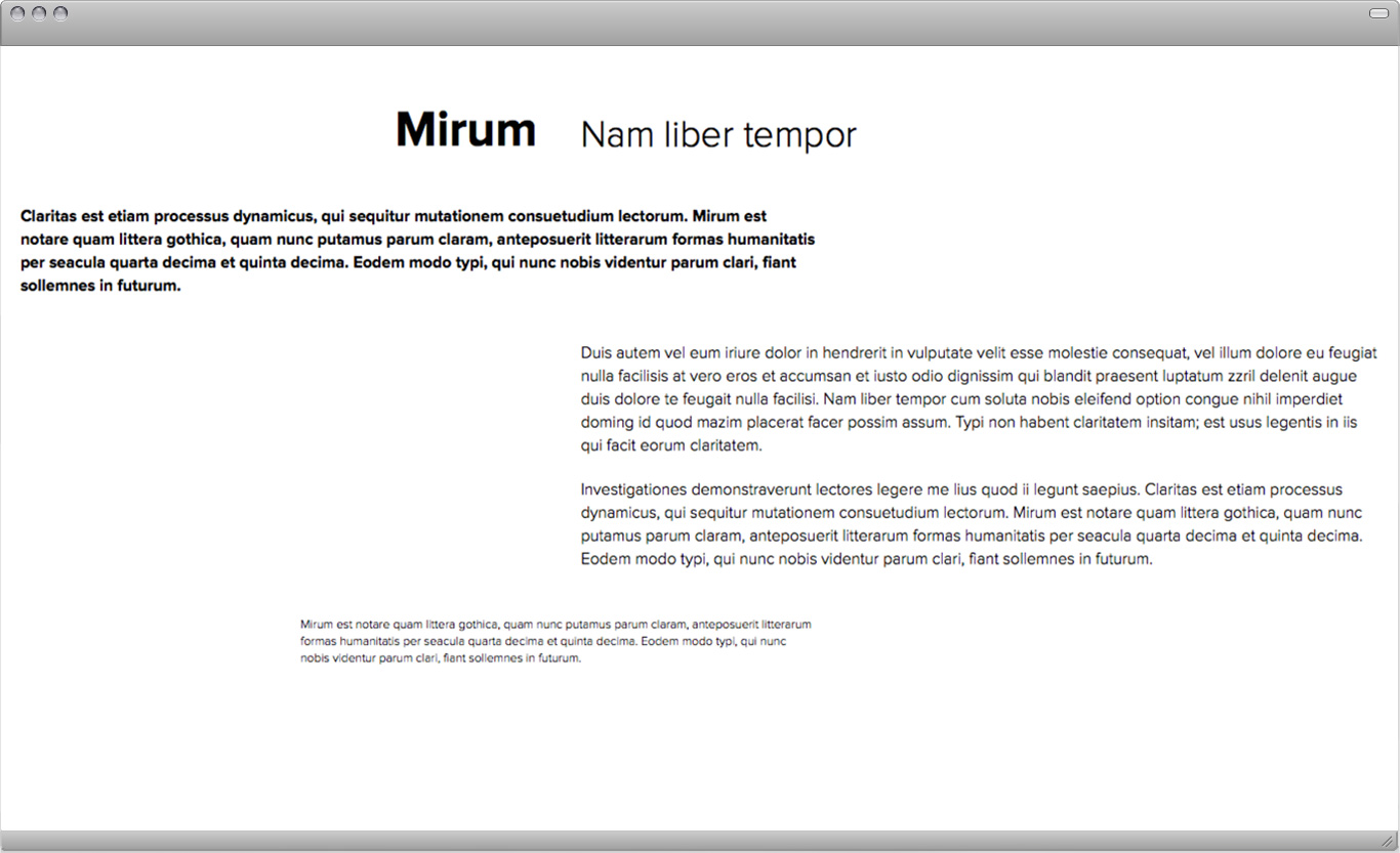
<div class="column-20 min-height-05 t-right"><br />
<h1 class="bold">Mirum</h1><br />
</div><br />
<br />
<div class="column-40 min-height-05"><br />
<h2>Nam liber tempor</h2><br />
</div><br />
<br />
<div class="column-20 min-height-05"></div><br />
<br />
<br />
<br />
<!--row 3--><br />
<div class="column-60 min-height-05 clear"><br />
<p class="intro">Claritas est etiam processus dynamicus, qui sequitur mutationem consuetudium lectorum. Mirum est notare quam littera gothica, quam nunc putamus parum claram, anteposuerit litterarum formas humanitatis per seacula quarta decima et quinta decima. Eodem modo typi, qui nunc nobis videntur parum clari, fiant sollemnes in futurum.</p><br />
</div><br />
<br />
<div class="column-20 min-height-05"></div><br />
<div class="column-20 min-height-05"></div><br />
<br />
<br />
<br />
<!--row 4--><br />
<div class="column-20 min-height-05 clear"></div><br />
<div class="column-20 min-height-05"></div><br />
<br />
<div class="column-60 min-height-05"><br />
<p>Duis autem vel eum iriure dolor in hendrerit in vulputate velit esse molestie consequat, vel illum dolore eu feugiat nulla facilisis at vero eros et accumsan et iusto odio dignissim qui blandit praesent luptatum zzril delenit augue duis dolore te feugait nulla facilisi. Nam liber tempor cum soluta nobis eleifend option congue nihil imperdiet doming id quod mazim placerat facer possim assum. Typi non habent claritatem insitam; est usus legentis in iis qui facit eorum claritatem.</p> <br /><br /><p>Investigationes demonstraverunt lectores legere me lius quod ii legunt saepius. Claritas est etiam processus dynamicus, qui sequitur mutationem consuetudium lectorum. Mirum est notare quam littera gothica, quam nunc putamus parum claram, anteposuerit litterarum formas humanitatis per seacula quarta decima et quinta decima. Eodem modo typi, qui nunc nobis videntur parum clari, fiant sollemnes in futurum.</p><br />
</div><br />
<br />
<br />
<br />
<!--row 5--><br />
<div class="column-20 min-height-05 clear"></div><br />
<br />
<div class="column-40 min-height-05"><br />
<p class="footnote">Mirum est notare quam littera gothica, quam nunc putamus parum claram, anteposuerit litterarum formas humanitatis per seacula quarta decima et quinta decima. Eodem modo typi, qui nunc nobis videntur parum clari, fiant sollemnes in futurum.</p><br />
</div><br />
<br />
<div class="column-20 min-height-05"></div><br />
<div class="column-20 min-height-05"></div><br />
<br />
<br />
</body>
Notice that in this example our body element has a certain class (here "comp-1"). And the rules for p, h1, h2 etc. have the ".comp-1" class selector added in front. This basically means that all the elements within this body behave a certain way. This treatment allows us to write other rules for the second composition if we give that body element a class called "comp-2" for example.
In CSS the more specific rules overwrite the general rules. In this example the classes ".intro" and ."footnote" overwrite the more general "p" rule and style the text bold (intro) or smaller (footnote).
For more details about this please read page 226-244 in the book. If you don't have the book read this PDF.
CSS code:
/* 4-1 (same for all compositions)*/ <br>
 <br>
body { <br>
   font-family: 'ProximaNovaLight';  <br>
} <br>
 <br> <br>  <br>

/* 4-1-1 (rules for a specific composition) */  <br>  <br>

.comp-1 h1 { <br>
   font-size: 48px;	 <br>
   font-family: 'ProximaNovaBold';  <br>
   text-align: right; <br>
   margin: 20px 20px 20px 20px; <br>
} <br>
.comp-1 h2 { <br>
   font-size: 36px;	 <br>
   margin: 25px 20px 20px 20px; <br>
} <br>
.comp-1 p { <br>
   font-size: 16px;	 <br>
   margin: 20px 20px 20px 20px; <br>
   line-height: 22px; <br>
} <br>
.comp-1 .intro { <br>
   font-family: 'ProximaNovaBold';  <br>
} <br>
.comp-1 .footnote { <br>
   font-size: 12px; <br>
   line-height: 16px; <br>
} <br>

final result in browser:
Further Reading:
Modularity
Every design problem is completed within a set of constraints or limitations. Modularity is a special kind of constraint. A module is a fixed element used within a larger system or structure. For example, a pixel is a module that builds a digital image. A pixel is so small, we rarely stop to notice it, but when designers create pixel-based typefaces, they use a grid of pixels to invent letterforms that are consistent from one to the next while giving each one a distinctive shape. A nine-by-nine grid of pixels can yield an infinite number of different typefaces. Likewise, a tiny handful of LEGO bricks contains an astonishing number of possible combinations.’ The endless variety of forms occurs, however, within the strict parameters of the system, which permits just one basic kind of connection. Building materials—from bricks to lumber to plumbing parts—are manufactured in standard sizes. By working with ready-made materials, an architect helps control construction costs while also streamlining the design process.
Designers are constantly making decisions about size, color, placement, proportion, relationships, and materials as well as about subject matter, style, and imagery. Sometimes, the decision-making process can be so overwhelming, it’s hard to know how to begin and when to stop. When a few factors are determined in advance, the designer is free to think about other parts of the problem. A well-defined constraint can free up the thought process by taking some decisions off the table.
In creating a page of typography, for example, a designer can choose to work within the constraints of one or two type families, and then explore different combinations of size, weight, and placement within that family of elements. The book you are reading is organized around a typographic grid whose basic module is a square. By accepting the square unit as a given, we were able to mix and match images while creating a feeling of continuity across the book. The square units vary in size, however (keeping the layouts from getting dull), and some pictures stretch across more than one module (or ignore the grid altogether). Rules are helpful, but it’s fun to break them. –Ellen Lupton