

Assignment 1-3: Proportions
For the next assignment you will continue to use various border widths. The new variables are the column width and height. You are free to choose widths and heights yourself. You have to make sure that the sum of all column widths adds up to a hundred percent in one row, the same applies to the heights. The one constant is the total number of rectangles should be 25 (in 5 columns and 5 rows).
Create CSS rules and apply classes to the HTML Markup
Fixed: Number 5 colums, 5 rows (25 div elements). Variables: Border weight, column width and row height.
Example CSS code:
/* 10-column grid / matching name and value:*/ <br> <br>
.column-05 { width: 5%; float: left; } <br>
.column-10 { width: 10%; float: left; } <br>
.column-20 { width: 20%; float: left; } <br>
.column-30 { width: 30%; float: left; } <br>
.column-40 { width: 40%; float: left; } <br>
.column-50 { width: 50%; float: left; } <br>
.column-60 { width: 60%; float: left; } <br>
.column-70 { width: 70%; float: left; } <br>
.column-80 { width: 80%; float: left; } <br>
.column-90 { width: 90%; float: left; } <br>
.column-100 { width: 100%; float: left; } <br>
 <br> <br>
/* heights */ <br> <br>
.height-05 { height: 5%; } <br>
.height-10 { height: 10%; } <br>
.height-20 { height: 20%; } <br>
.height-30 { height: 30%; } <br>
.height-40 { height: 40%; } <br>
.height-50 { height: 50%; } <br>
.height-60 { height: 60%; } <br>
.height-70 { height: 70%; } <br>
.height-80 { height: 80%; } <br>
.height-90 { height: 90%; } <br>
.height-100 { height: 100%; } <br>
 <br> <br>
/* top borders: */ <br> <br>
.border-t-01 { border-top: 1px solid #000; } <br>
.border-t-05 { border-top: 5px solid #000; } <br>
.border-t-10 { border-top: 10px solid #000; } <br>
.border-t-15 { border-top: 15px solid #000; } <br>
.border-t-20 { border-top: 20px solid #000; } <br>
.border-t-25 { border-top: 25px solid #000; } <br>
 <br> <br>
/* right borders: */ <br> <br>
.border-r-01 { border-right: 1px solid #000; } <br>
.border-r-05 { border-right: 5px solid #000; } <br>
.border-r-10 { border-right: 10px solid #000; } <br>
.border-r-15 { border-right: 15px solid #000; } <br>
.border-r-20 { border-right: 20px solid #000; } <br>
.border-r-25 { border-right: 25px solid #000; } <br>
 <br> <br>
/* bottom borders: */ <br> <br>
.border-b-01 { border-bottom: 1px solid #000; } <br>
.border-b-05 { border-bottom: 5px solid #000; } <br>
.border-b-10 { border-bottom: 10px solid #000; } <br>
.border-b-15 { border-bottom: 15px solid #000; } <br>
.border-b-20 { border-bottom: 20px solid #000; } <br>
.border-b-25 { border-bottom: 25px solid #000; } <br>
 <br> <br>
/* left borders: */ <br> <br>
.border-l-01 { border-left: 1px solid #000; } <br>
.border-l-05 { border-left: 5px solid #000; } <br>
.border-l-10 { border-left: 10px solid #000; } <br>
.border-l-15 { border-left: 15px solid #000; } <br>
.border-l-20 { border-left: 20px solid #000; } <br>
.border-l-25 { border-left: 25px solid #000; } <br>

 <br>
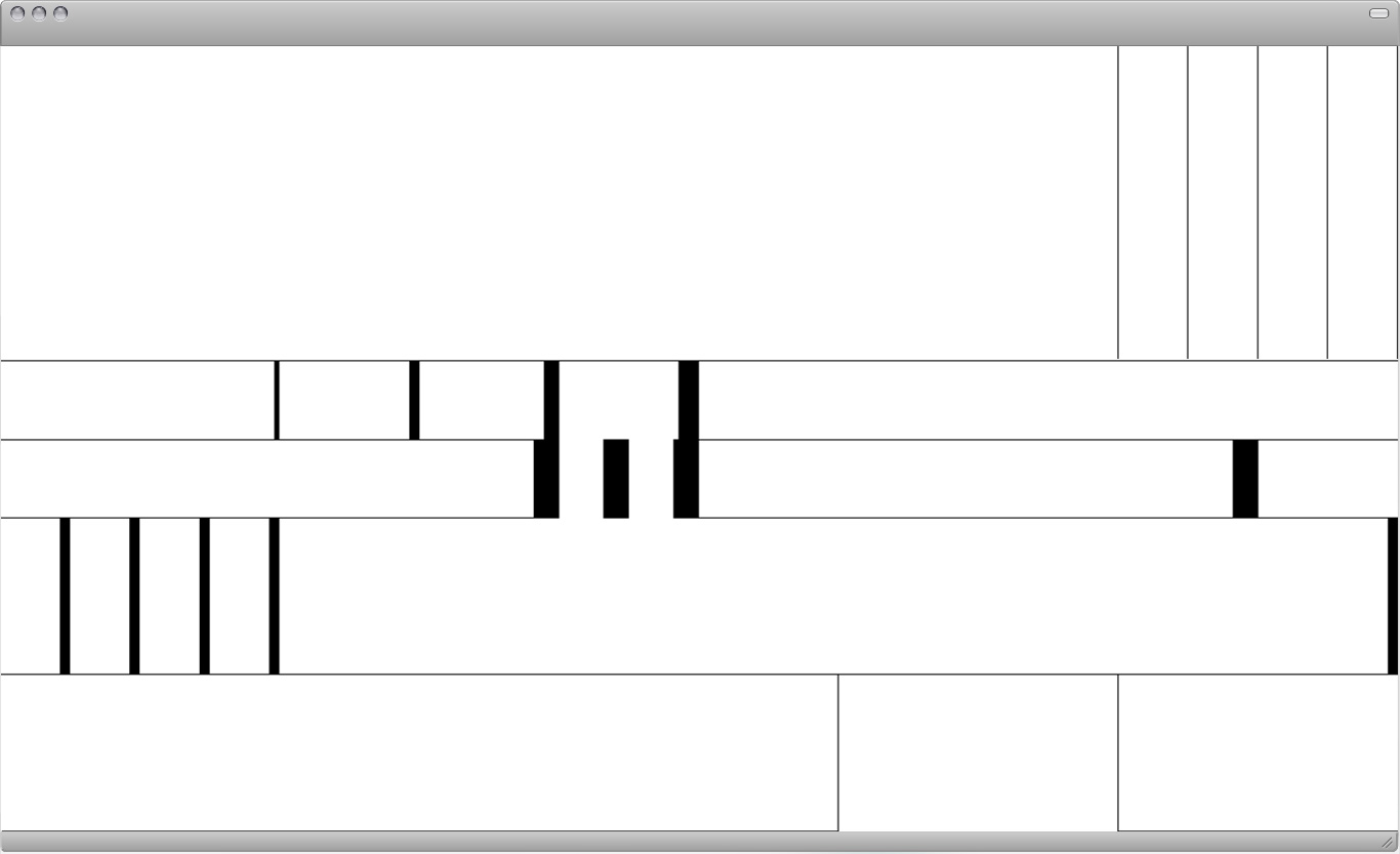
<div class="column-80 height-40 border-r-01 border-b-01"></div><br />
<div class="column-05 height-40 border-r-01 border-b-01"></div><br />
<div class="column-05 height-40 border-r-01 border-b-01"></div><br />
<div class="column-05 height-40 border-r-01 border-b-01"></div><br />
<div class="column-05 height-40 border-r-01 border-b-01"></div><br />
<br />
<div class="column-20 height-10 border-r-05 border-b-01"></div><br />
<div class="column-10 height-10 border-r-10 border-b-01"></div><br />
<div class="column-10 height-10 border-r-15 border-b-01"></div><br />
<div class="column-10 height-10 border-r-20"></div><br />
<div class="column-50 height-10 border-b-01"></div><br />
<br />
<div class="column-40 height-10 border-r-25 border-b-01"></div><br />
<div class="column-05 height-10 border-r-25"></div><br />
<div class="column-05 height-10 border-r-25"></div><br />
<div class="column-40 height-10 border-r-25 border-b-01"></div><br />
<div class="column-10 height-10 border-b-01"></div><br />
<br />
<div class="column-05 height-20 border-r-10 border-b-01"></div><br />
<div class="column-05 height-20 border-r-10 border-b-01"></div><br />
<div class="column-05 height-20 border-r-10 border-b-01"></div><br />
<div class="column-05 height-20 border-r-10 border-b-01"></div><br />
<div class="column-80 height-20 border-r-10 border-b-01"></div><br />
<br />
<div class="column-60 height-20 border-r-01 border-b-01"></div><br />
<div class="column-20 height-20 border-r-01"></div><br />
<div class="column-20 height-20 border-b-01"></div>
Task: Explore layout possibilities with those new variables
Create and submit 5 final layouts.
Further Readings
Working with Constraints
Graphic designers have used modular elements to produce unpredictable results. Try looking at familiar systems from a fresh angle. Given the constraints of any system, how can you play with the rules to make something new?
A child’s set of alphabet blocks looks a certain way, for example, because the blocks are made from perfect cubes. But what if alphabet blocks were made from rectangles instead of cubes? The oddly proportioned faces of the blocks at left provided a framework for designing new letterforms in response to the constraints provided by the blocks of wood.
Standard materials such as laser paper are often used in generic ways. A standard sheet of office paper can be very dull indeed. Yet with creative thinking, an ordinary piece of paper can be used for dramatic effect.
Variations
Variation involves change—the vitality of transformation, in contrast to constancy —the fixity of the invariable. In music variation means the mutation of a musical idea, the transformation of a theme or a mean value. Variation involves singling out a mean value and calls for the ability to put this mean value through as many transformations as possible.
The aim is to devise hundreds of arrangements while adhering strictly to the theme in question, and it is a good plan to sketch out these various ideas in preprinted squares. Elementary exercises like these help the typographer to develop versatility and the ability to see a given theme in a multitude of different ways and to tackle it from different angles.
—Emil Ruder
Proportions
Every means at the disposal of man in his creative activities has its value and its extent. In architecture we have the surfaces which enclose space and the volume thus enclosed. Typography is restricted to two-dimensional space. Even with a single value the problem of proportion still arises, for the relationship of length, breadth and depth has to be settled. Once a plurality of means is used, the real problem of proportion must be faced: the organization of several things in a certain relationship of size.
For centuries, from the number mysticism of the Middle Ages, through the proportional systems of the Renaissance, down to Le Corbusier’s module, man has endeavoured to subject objects of different dimensions to certain rules and fixed numerical systems. These efforts have had two results: Work created out of feeling and intuition and subsequently subordinated to a numerical pattern has been erroneously placed with works constructed on a principle reached by calculation. More important, however, is the fact that proportional systems based on calculation have barred the way to creative work; they have become crutches to support the incompetent. Le Corbusier’s module came at the end of a long, creative life, rich in experience and insights; but for the young student of architecture the same module is a pitfall and a hazard. Ostwald’s extensive efforts to number all colours and to bring the “right” colours together has made no contribution whatever to a real colour culture.
No system of ratios, however ingenious. can relieve the typographer of deciding how one value should be related to another. He must first recognize the individual value before he can work with it. He must spare no effort to tutor his feeling for proportion so that he can judge how much a given ratio can bear. He must know intuitively when the tension between several things is so great that harmony is endangered. But he must also know how to avoid relationships lacking in tension since these lead to monotony. Whether the tension should be strong or weak is a decision which the typographer must make for himself in the light of the problem he is seeking to solve. This is an argument against a rigid numerical principle such as the Golden Section of 3:5:8: 13, for this principle may be right for one work but wrong for another.
Typographical design calls for the recognition of values which become visible during the setting process and have to be organized according to the following criteria: What is the relationship between one value and another? How is a given type size related to a second or third ? What are the relations between the printed and unprinted areas? What is the relationship between the colour value and quality and the grey of the type matter? How do the various tones of grey compare? The proper observation of these principles is crucial for the beauty of a printed work, and for its formal and functional qualities.
—Emil Ruder