Setup site folder, documents and the layout grid
This will be the setup for the following assignments. Organization is very important. The HTML and CSS code needs to be structured well in oder to visually identify sections. The better the organization is the easier it'll be to detect errors later on. Also files and folder structure needs to be clean and consistent in order to keep linking the files simple.
Step 1: Site folder
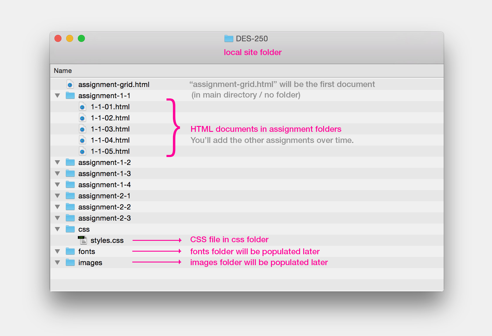
Follow the example below. Create a folder on your hardrive called "DES-250" and add 4 more folders to it: "assignment-1-1", "css", "fonts" and "images". The "fonts" and "images" folders will initially stay empty. The example shows our structre at a later stage. You complete this setup with only two documents: "assignment-grid.html" in the main directory and "styles.css" inside the "css" folder. Later you'll add a folder for each assignment and add the compositions (HTML) to those folders.
Step 2: Create a (blank) HTML page
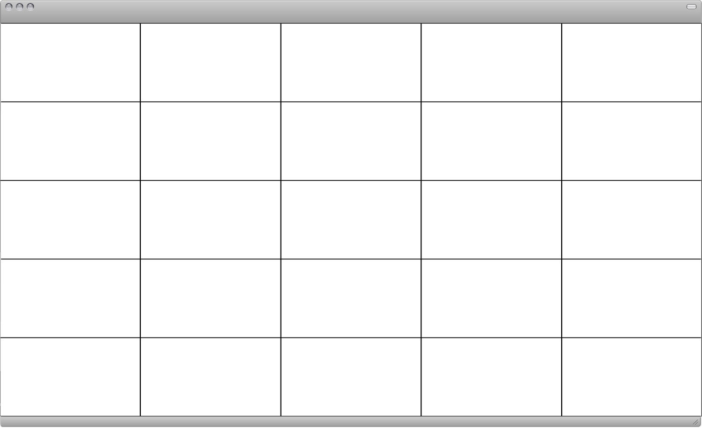
Create a blank HTML page and make sure it matches the example below. Name it "assignment-grid.html" and save it into the main directory of the local site folder (DES-250).
HTML code:
<!doctype html><br />
<html><br />
<br />
<head><br />

<title>Grid</title><br />

</head><br />
<br />
<body><br />
</body><br />
<br />
</html><br />
Step 3: Create a CSS document
Create a CSS document and copy the code below to the top of your CSS document. It containes a couple or CSS rules that'll simplify working with your own rules later on. I explain in detail what function they have. Add you own rules below all of it. This CSS file will style all of your compositions. Code will be added over time so type to keep the code as organized and clean as possible.
CSS code:
@charset "UTF-8";<br />
/* CSS Document */<br /><br />

/* Reset browser default styles: */<br />
html, body, h1, h2, h3, h4, h5, h6, p, ol, ul, li, pre, code, address, variable, form, fieldset, blockquote {<br />
  padding: 0;<br />
  margin: 0;<br />
  font-size: 100%;<br />
  font-weight: normal;<br />
}<br />
<br />
/* border-box so that border widths aren't added to the total width of the element: */<br />
html {<br />
    box-sizing: border-box;<br />
}<br /><br />
*, *:before, *:after {<br />
   box-sizing: inherit;<br />
}<br />
<br />
/* Clearfix to make floated elements behave correctly: */<br />
  .cf:before, .cf:after { content: ""; display: table; }<br />
  .cf:after { clear: both; }<br />
  .cf { zoom: 1; }<br />
<br />
/* In order for the percentage heights to work we need this: */<br />
html, body { height:100%; }<br />
Step 4: Link HTML and CSS, add HTML elements and style them with CSS rules
We'll be using "div" elements to create a 5-column / 5-row layout grid. Then we add so-called "classes" to each div element. Code is very sensitive so make sure all characters match the example below. One missing or wrong character may break the layout. Classes "sit" in quotes and a seperated by a blank space. In our case we'll add 3 classes for each div element: one defines the width, one the height and the 3rd one applies a border/outline around each div. Initially those classes inside the HTML markup have no effect. The CSS code will make them visible.
HTML code:
<!doctype html><br />
<html><br />
<br />
<head><br />
<title>Grid</title><br />
<span class="pink"><link href="css/styles.css" rel="stylesheet" type="text/css"><br /></span>
</head><br />
<br />
<body><br />
<br />
<div class="column-20 height-20 border-01"></div><br />
<div class="column-20 height-20 border-01"></div><br />
<div class="column-20 height-20 border-01"></div><br />
<div class="column-20 height-20 border-01"></div><br />
<div class="column-20 height-20 border-01"></div><br />
<br />
<div class="column-20 height-20 border-01"></div><br />
<div class="column-20 height-20 border-01"></div><br />
<div class="column-20 height-20 border-01"></div><br />
<div class="column-20 height-20 border-01"></div><br />
<div class="column-20 height-20 border-01"></div><br />
<br />
<div class="column-20 height-20 border-01"></div><br />
<div class="column-20 height-20 border-01"></div><br />
<div class="column-20 height-20 border-01"></div><br />
<div class="column-20 height-20 border-01"></div><br />
<div class="column-20 height-20 border-01"></div><br />
<br />
<div class="column-20 height-20 border-01"></div><br />
<div class="column-20 height-20 border-01"></div><br />
<div class="column-20 height-20 border-01"></div><br />
<div class="column-20 height-20 border-01"></div><br />
<div class="column-20 height-20 border-01"></div><br />
<br />
<div class="column-20 height-20 border-01"></div><br />
<div class="column-20 height-20 border-01"></div><br />
<div class="column-20 height-20 border-01"></div><br />
<div class="column-20 height-20 border-01"></div><br />
<div class="column-20 height-20 border-01"></div><br />
<br />
</body><br />
<br />
</html><br />
.column-20 { width: 20%; float: left; } <br/>
.height-20 { height: 20%; } <br/>
.border-01 { border: 1px solid #000; }