

Assignment 4_2: Typography_Text and Lines
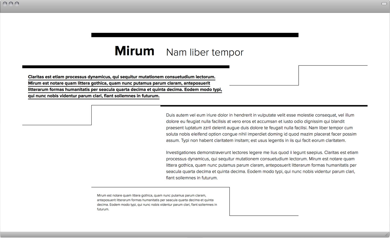
Start with one of the compositions from the last assignment (4-1). Together we will decide which composition to proceed with. You should add lines to this exercise. The goal is to shift or reinforce the already established visual hierarchy. For example, lines can be used to separate the information (head, subhead, intro, body copy, footnote) or alter the importance of it by adding lines to specific div elements, words or between text in paragraphs. Lines can also drastically shift the balance and activity of the page.
Fixed: Use existing composition, type should not be moved
Variables: Widths, heights of rows, line weights
Goal: Reinforce visual hierarchy with lines, shift balance/activity, or shift hierarchy
Task: The main design question is how many ways can I change my primary composition? Create 5 compositions.
Due: Tuesday, October 18
Preparation
Open the HTML from the previous assignment and save it under a different name ("assigment-4-2-1.html", for example). Give the body element a new class in oder to write specific CSS rules for your new compositions ("lines-1" in example below).
What is new in the HTML below is a div element that serves as a container for the layout. Once such a container is in place it can be used to restrict the width of the layout on big screens as well as to center the layout in the browser (if desired). The container div wraps around all other elements so its opening tag is at the top (right after the body opening tag) and its closing tag at the bottom of the HTML (right before the body closes). The "max-width" value allows the container to shrink but not get bigger than a certain width. Left and right margins set to "auto" will center the layout in the browser.
This is an optional task but it may be necessary to adjust a few things in the layout for small screens. You can mimic a small screen by reducing the width of your browser window. In the example below one div element containing text is too small/narrow to make all the text fit. You can write media queries in your CSS (in blue below) and make this element wider at a certain browser size. The example below shows how to turn a 40% column width to a 60% width if the browser is smaller than 800px. The rule "small-width-60" overwrites "column-40" once the browser reaches 800px and smaller. Note that if one column width changes you need to adjust others so that the sum of all don't exceed 100%. In the example, below I'm hiding one of the columns completely ("hide-if-small" rule). HTML code:
<body class="<strong>lines-1</strong>"><br />
<strong><div id="container" class="cf"></strong><br />
<br />
<!--row example--><br />
<div class="column-20 height-10 clear"></div><br />
<div class="column-20 height-10 <strong>rightline-1</strong>"></div><br />
<div class="column-40 height-10 <strong>topline-15</strong> <strong>small-width-60</strong>"><p>More width needed when browser is small.</p></div><br />
<div class="column-20 height-10 <strong>hide-if-small</strong>"></div><br />
<br />
<strong></div></strong><br />
</body>
/* rule for container to limit width of layout */ <br><br>
#container {  <br>
   max-width: 1200px; <br>
   margin: 0px auto 0px auto; <br>
   height: 100%; <br>
} <br> <br> <br>

/* new rules for lines */ <br><br>
.lines-1 .topline-15 { <br>
   border-top: 15px solid black; <br>
} <br>
<!--.lines-1 .topline-10 { <br>
   border-top: 10px solid black; <br>
} <br>
.lines-1 .topline-5 { <br>
   border-top: 5px solid black; <br>
} <br>
.lines-1 .topline-1 { <br>
   border-top: 1px solid black; <br>
} <br>
.lines-1 .underline-2 { <br>
   border-bottom: 2px solid black;	 <br>
} <br>
.lines-1 .bottomline-1 { <br>
   border-bottom: 1px solid black; <br>
} <br>
.lines-1 .leftline-1 { <br>
   border-left: 1px solid black; <br>
} <br>-->
.lines-1 .rightline-1 { <br>
   border-left: 1px solid black; <br>
} <br><br><br>

<span class="light-blue">/* media queries to adjust things for small screens */ <br><br>
@media (max-width: 800px) { <br>
.small-width-60 { <br>
   width: 60% !important;	 <br>
} <br>
.hide-if-small { <br>
   display: none;  <br>
} <br>
} <br></span>
Example
Further Reading:
Rhythm
Typography involves a number of processes of a very technical character. Type is cast by a highly ingenious technical process, set by machines of complex design, and printed with machines of every kind and size. The machine determines the very nature of typography. The machine functions at its own even tempo; vital and individual rhythms are alien to it. Unlike machine work, manual work, however modest, gives expression to a pulsing, rhythmic movement. The basic difference is well exemplified by a hand-woven and a machine-woven carpet.
Handwriting is full of rhythms: its appearance is determined by effect and countereffect: straight-round, vertical-horizontal, slope-counterslope, curve-counter curve, weight-counterweight, pull-counter pull, upstroke-downstroke. etc. Handwriting can be seen to underlie any good typeface. The process of type-casting (drawing, cutting, punching or molding, casting) no doubt weakens the rhythm of handwriting but the original written form of the letter should not be completely effaced. A typeface in which something of the original written form cannot be discerned may be rightly called degenerate. The changing pattern of thick and thin strokes in writing with a broad-nibbed pen must be retained in the thick and thin strokes of every typeface, even in sans-serif, so that letterpress can also be enjoyed as a rhythmic pattern.
Lining up letters to form a word, a line, a type area, affords further opportunities for introducing rhythm. These rhythmic values, which the typographer should recognize and appreciate, vary according to word and language. A word with a particular rhythmic charm about its appearance should be made to stand out and become the dominant value of a work. The interword space is the basic means of imparting rhythm to words of different length and weight; narrow interword spacing slackens tension, uniform spacing virtually precludes it and variety of spacing enhances it.
A mass of type can be rhythmized by unequal leading, by variety in the length of the lines, by the white of blank spaces in break lines. and by grading the size of the type. The dominant black of a large size of type may be enriching in its effect and in many cases acts as a dividing and patterning element which breaks up the type into rhythmically unequal values. Large type, however, should be clearly set off from its surroundings so that it can perform its rhythmizing function.
The width and height of the paper are part of the overall rhythmic pattern and the typographer can position word. line and type mass so as to be in or out of rhythm with the format. With an upright or broadside format, a square area of type matter can be imposed in such a way that the two-beat rhythm contrasts with the even measure of the type area. Such contrasts of rhythmic movement afford innumerable possibilities; but the typographer must know in each phase of his work just what rhythms are inherent in it. —Emil Ruder