

Assignment 2-2: Color and Lightness
Just as in the previous assignment we'll be using our original grid as a start consisting of 5 columns and 5 rows (25 div elements, no borders).
Add new background-color rules to your CSS file and apply those styles to your HTML elements.
Fixed: 5 colums, 5 rows, 1 color (red-orange).
Variables: Widths, heights, color lightness.
Theme: Light to dark
This time we focus on the color lightness. By using one base hue (red-orange in our case) and adjusting the lightness values you can define white, black, red-orange and all color tints and shades in between.
Example CSS code:
/* grid layout */ <br> <br>
.column-20 { width: 20%; float: left; } <br>
.height-20 { height: 20%; } <br>
<br> <br>

/* red-orange + lightness*/ <br> <br>
.orange-l-10 { background-color: hsl(15,100%,10%); } <br>
.orange-l-20 { background-color: hsl(15,100%,20%); } <br>
.orange-l-30 { background-color: hsl(15,100%,30%); } <br>
.orange-l-40 { background-color: hsl(15,100%,40%); } <br>
.orange-l-50 { background-color: hsl(15,100%,50%); } <br>
.orange-l-60 { background-color: hsl(15,100%,60%); } <br>
.orange-l-70 { background-color: hsl(15,100%,70%); } <br>
.orange-l-80 { background-color: hsl(15,100%,80%); } <br>
.orange-l-90 { background-color: hsl(15,100%,90%); } <br>
.orange-l-100 { background-color: hsl(15,100%,100%); } <br>


 <br>
<div class="column-20 height-10 orange-l-100"></div><br />
<div class="column-05 height-10 orange-l-90"></div><br />
<div class="column-05 height-10 orange-l-80"></div><br />
<div class="column-60 height-10 orange-l-70"></div><br />
<div class="column-10 height-10 orange-l-60"></div><br />
<br />
<div class="column-20 height-10 orange-l-90"></div><br />
<div class="column-05 height-10 orange-l-80"></div><br />
<div class="column-05 height-10 orange-l-70"></div><br />
<div class="column-60 height-10 orange-l-60"></div><br />
<div class="column-10 height-10 orange-l-50"></div><br />
<br />
<div class="column-20 height-70 orange-l-80"></div><br />
<div class="column-05 height-70 orange-l-70"></div><br />
<div class="column-05 height-70 orange-l-60"></div><br />
<div class="column-60 height-70 orange-l-50"></div><br />
<div class="column-10 height-70 orange-l-40"></div><br />
<br />
<div class="column-20 height-05 orange-l-70"></div><br />
<div class="column-05 height-05 orange-l-60"></div><br />
<div class="column-05 height-05 orange-l-50"></div><br />
<div class="column-60 height-05 orange-l-40"></div><br />
<div class="column-10 height-05 orange-l-30"></div><br />
<br />
<div class="column-20 height-05 orange-l-60"></div><br />
<div class="column-05 height-05 orange-l-50"></div><br />
<div class="column-05 height-05 orange-l-40"></div><br />
<div class="column-60 height-05 orange-l-30"></div><br />
<div class="column-10 height-05 orange-l-20"></div>
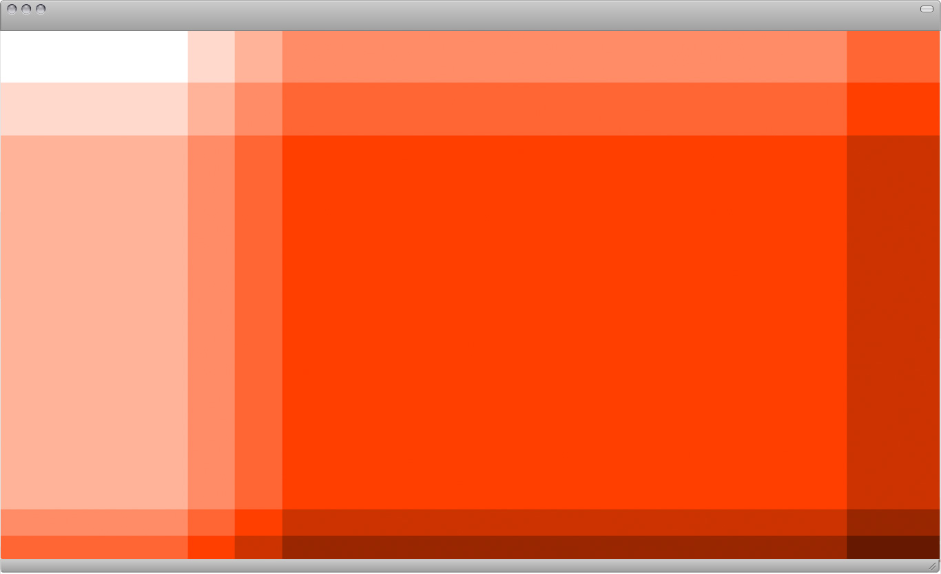
Task: Create different compositions by applying color to the div elements
A light to dark progression should be present visually. Work on different ideas and submit 5 final layouts.
Further Reading:
Balance
Balance is a fundamental human condition: we require physical balance to stand upright and walk; we seek balance among the many facets of our personal and professional lives; the world struggles for balance of power. Indeed, balance is a prized commodity in our culture, and it is no surprise that our implicit, intuitive relationship with it has equipped us to sense balance—or imbalance—in the things we see, hear, smell, taste, and touch.
In design, balance acts as a catalyst for form—it anchors and activates elements in space. Do you ever notice your eye getting stuck in a particular place when looking at an unresolved design? This discord usually occurs because the proportion and placement of elements in relation to each other and to the negative space is off—too big, too tight, too flat, misaligned, and so on.
Relationships among elements on the page remind us of physical relationships. Visual balance occurs when the weight of one or more things is distributed evenly or proportionately in space. Like arranging furniture in a room, we move components around until the balance of form and space feels just right. Large objects are a counterpoint to smaller ones; dark objects to lighter ones.
A symmetrical design, which has the same elements on at least two sides along a common axis, is inherently stable. Yet balance need not be static. A tightrope walker achieves balance while traversing a precarious line in space, continually shifting her weight while staying in constant motion.
Designers employ contrasting size, texture, value, color, and shape to offset or emphasize the weight of an object and achieve the acrobat’s dynamic sense of balance. Symmetry is not the only way to achieve balance, however. Asymmetrical designs are generally more active than symmetrical ones, and designers achieve balance by placing contrasting elements in counterpoint to each other, yielding compositions that allow the eye to wander while achieving an overall stability.
—Ellen LuptonContrasts
Combining two values in accordance with the laws of contrast changes and enhances the effect of both values. Round treetops look rounder if there are angular buildings near them; a tower looks taller if it stands on a flat plain; a warm colour looks warmer if it is combined with a cold colour. The aesthetics and legibility of a typeface depend on the combination of contrasting forms: round and straight, broad and narrow, large and small, thin and thick, etc. The relationship between the printed and the unprinted area must be one of tension, and this tension comes about through contrasts. Values combined with equal values result in unrelieved monotony.
Thinking in terms of contrasts is not a confused way of thinking, for even contrasts can be united in a harmonious whole. There are concepts which become real only through their opposite, e.g. “above”, in conjunction with “below”, “horizontal” in conjunction with “vertical”, etc. Modern man thinks in contrasts. For him surface and space, far and near, inner and outer are no longer incompatible; for him there is not only an “either-or” but also a “both-and”.
In combining contrasting values, care must be exercised that the uniform effect of the whole remains unaffected. If the contrasts are violent, such as light and excessively dark, or large and excessively small, one element can be so dominant that the balance between it and the contrasting value is upset, or never comes into being at all.
—Emil Ruder