Assignment 5_3: CSS
Due: Nov 29., beginning of class
Grid Calculations
Our layout is based on a 6-column grid. Below are the percentage numbers needed for the CSS. Apply those percentages to your rules for the column DIVs. The margins are the spaces between the DIVs and are always 2% in this case. If you increase or reduce the margins you'd need to recalculate the widths of the divs. Important is that the sum of those numbers add up to 100% per row.
The container element relates to the browser. If you make the container 90% wide you always have a 5% margin on each side of the layout. You also might want to give this container a max-width in order for the layout not to get too wide on larger screens.
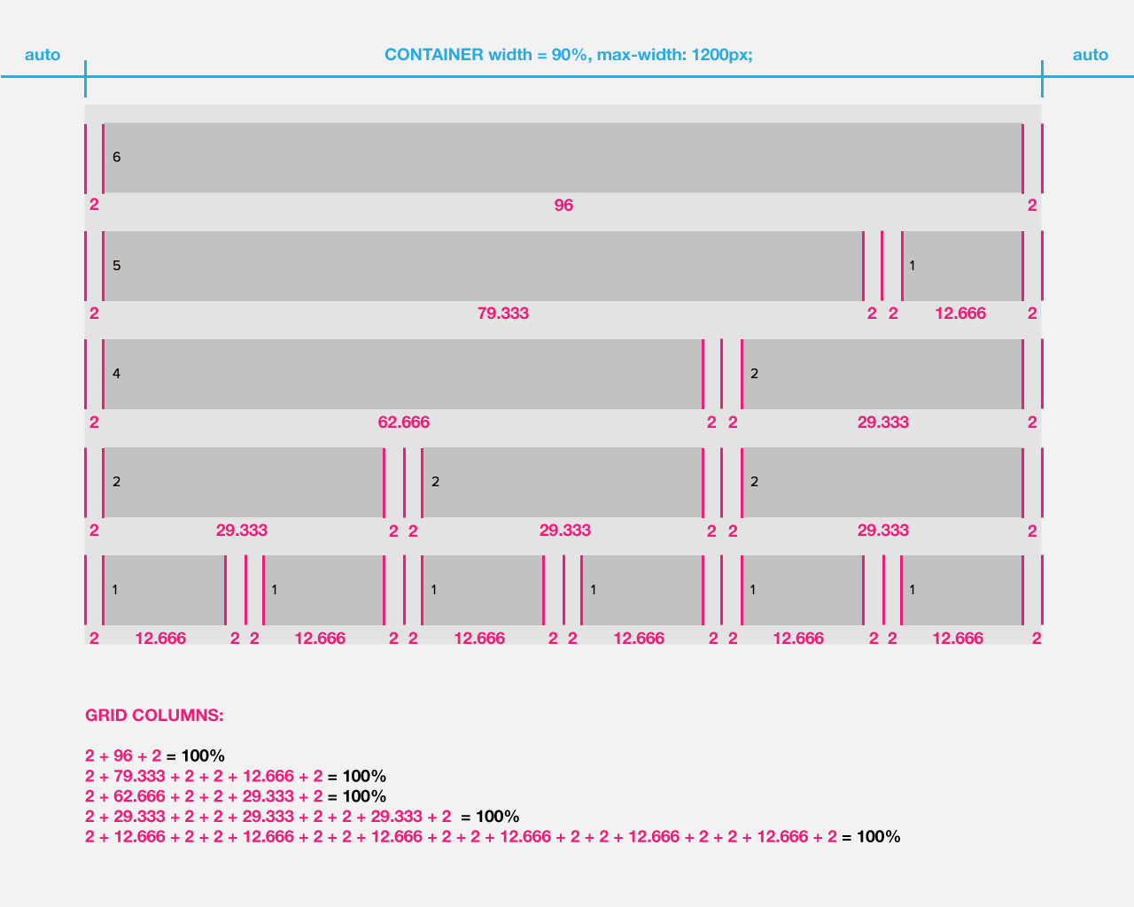
Example rules for the grid columns
Below are example rules for your grid columns. I recommend to use your own class/rule names for the DIVs. Although you could name "two_unit" it's better to use names like "headline" since the width may change on smaller screens. "two_unit" may change to "four_unit", for example. It's less confusing if you don't use widths in the names. Important: Rules should not start with a number after the period (".2_unit", for example).
Example CSS code:
.one_unit {<br>
   width: 12.666%;<br>
   margin: 0px 2% 0px 2%;;<br>
   float: left;<br>
}<br>
.two_unit {<br>
   width: 29.333%;<br>
   margin: 0px 2% 0px 2%;<br>
  	float: left;<br>
}<br>
.three_unit {<br>
   width: 46%;<br>
   margin: 0px 2% 0px 2%;<br>
  	float: left;<br>
}<br>
.four_unit {<br>
   width: 62.666%;<br>
   margin: 0px 2% 0px 2%;<br>
   float: left;<br>
}<br>
.five_unit {<br>
   width: 79.333%;<br>
   margin: 0px 2% 0px 2%;<br>
   float: left;<br>
}<br>
.six_unit {<br>
   width: 96%;<br>
   margin: 0px 2% 0px 2%;<br>
}<br>
Font Declarations (Helvetica)
The font files and font CSS already exist in your site folder you downloaded. Below are the font-families you can use:
.thin { font-family: 'HelveticaNeueLTStd-Th';}<br>
.light { font-family: 'HelveticaNeueLTStd-Lt';}<br>
.roman { font-family: 'HelveticaNeueLTStd-Roman';}<br>
.medium { font-family: 'HelveticaNeueLTStd-Md';}<br>
.bold { font-family: 'HelveticaNeueLTStd-Bd';}<br>
.heavy { font-family: 'HelveticaNeueLTStd-Hv';}<br>
.black { font-family: 'HelveticaNeueLTStd-Blk';}<br>
<br><br>
/* which you can apply to an element like this: */<br>
body {<br>
   font-family: 'HelveticaNeueLTStd-Roman';<br>
}<br>
h1 {<br>
   font-family: 'HelveticaNeueLTStd-Bd';<br>
}<br>
Responsive Images
In responsive design you make the images scale as big as their parent element allows it. The image size is set to 100%. You control the size of the images by sizing the container/parent element.
Example HTML code:
<div class="logos"><br />
	<div class="logo-1"><img src="images/uic-light.png" alt=""/></div><br />
	<div class="logo-2"><img src="images/open-house-light.png" alt=""/></div><br />
	</div>
.logos img { <br>
   width: 100%; <br>
   height: auto; <br>
} <br>
.logo-1 { <br>
   width: 45px; <br>
   float: left; <br>
} <br>
.logo-2 { <br>
   width: 220px; <br>
   float: left; <br>
} <br>
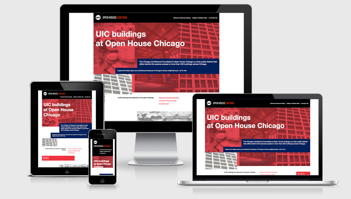
Coded Example Page
I coded one home page for your reference. If you want, take a look and let me know if you have any questions about the HTML or CSS code. Your layout is different and will need it's own CSS. So it doesn't really makes sense to copy and past everything into your own files. But understanding how the example is coded may help you with your own.